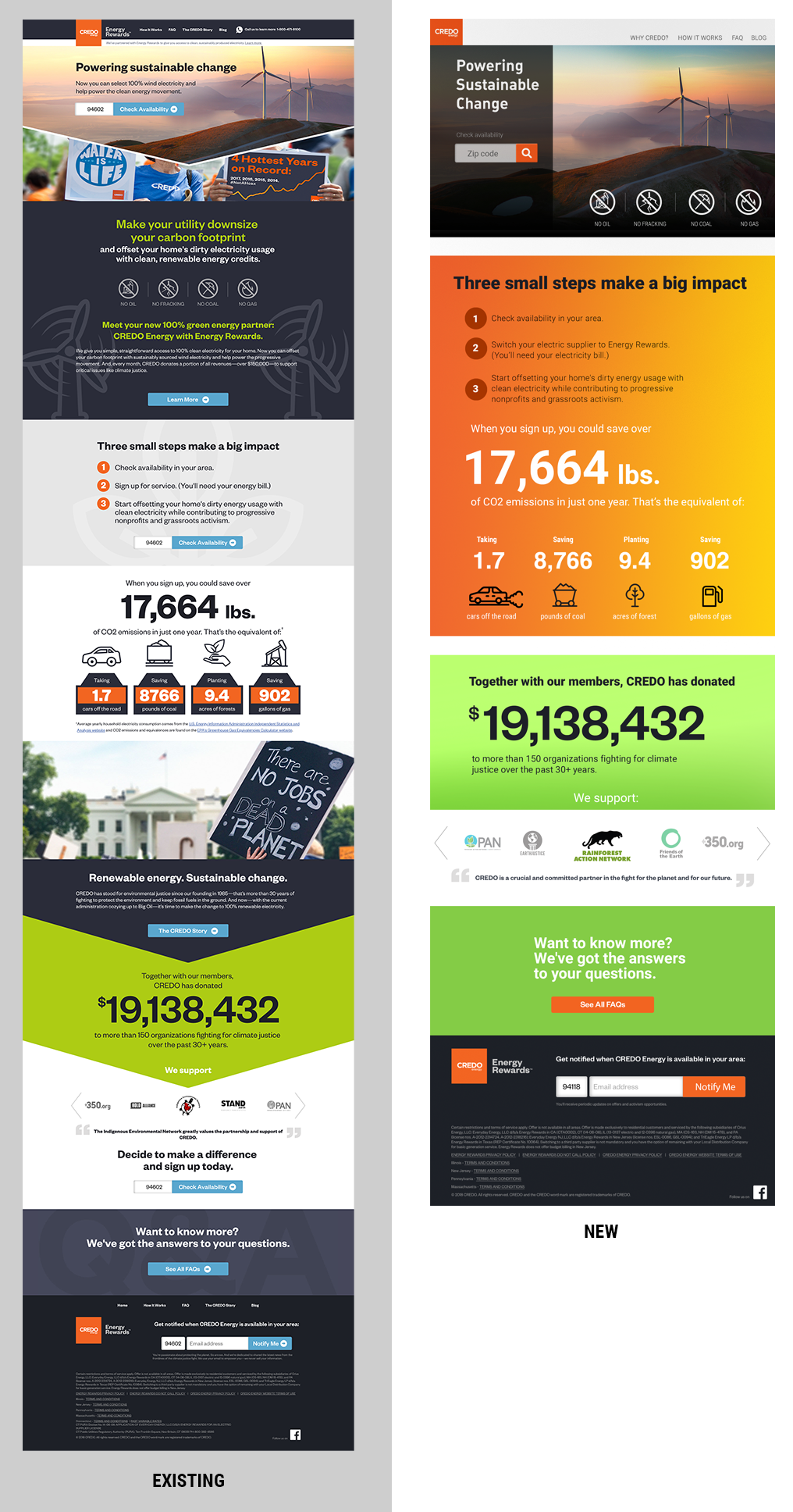
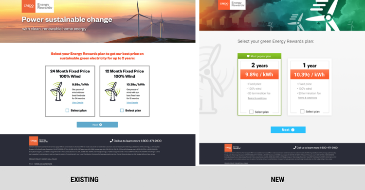
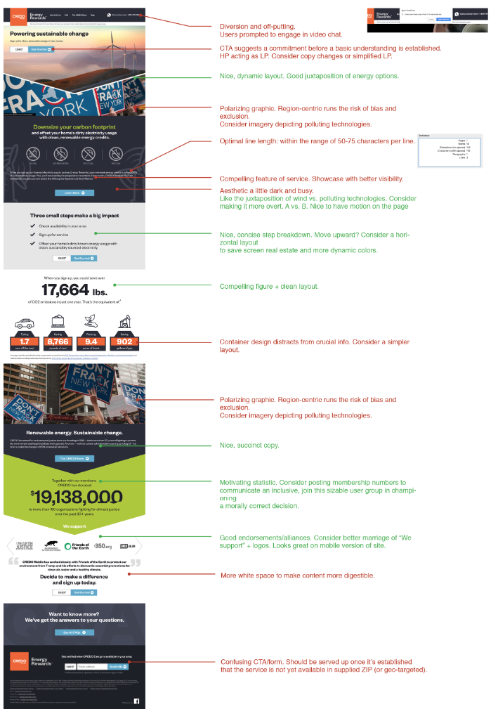
HP refresh. Increased conversion by:
Drastically reducing cognitive load—allowing a quicker read/assessment of service
Incentivize input with UI tweaks (size, palette, iconography, placement)
Establish hierarchy of salient numbers
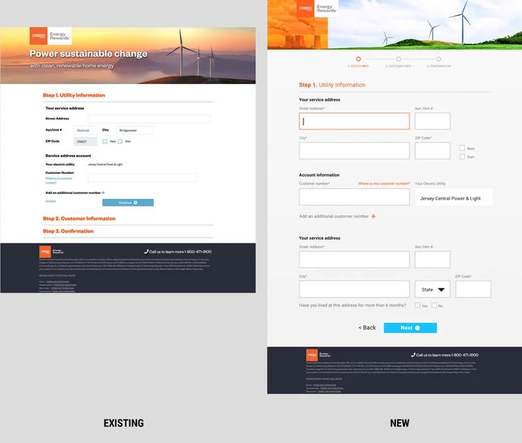
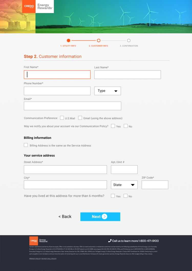
Improved sign-up flow with:
Breadcrumb/progress bar to clearly manage expectations and provide navigational reassurance
better chunking
Larger, simpler UI elements
Better call-to-action
Improving layout with: use of grey (while being mindful of accessibility issues), chunking, layout, proportion, hierarchy of elements on a page
HP audit. Exhaustive look at existing site, analytics, and usability sessions to tease out the friction points.

