(United Health)
Team: Health ecosystem UX/UI
UX/UI; Visual design—flows, prototypes, visual assets (DPL contributions(components, icons), landing pages, cart, modules ), usability (empathy maps, testing insights), marketing campaigns (social, emails, decks, print collateral), photography, and animated how-to videos (animation, sound design).
Solution/Role: Improve on UX friction points (cart, sign up, scheduling), rapidly build out new MVP products & services, elevating the aesthetic and interactions for a more robust, compelling experience while building momentum for future state and fast follows. Update brand/messaging to better reflect the robust ecosystem of Optum Store. Produce marketing campaign collateral to help conversion/click through and communicate ecosystem growth, extending reach and improve customer management.
Problem: Optum Store, though early to market with B2C pharmacy products, risks losing some traction and market share with subpar user experiences and a limited scope of online treatments and services. Additionally, brand and messaging due for refresh.
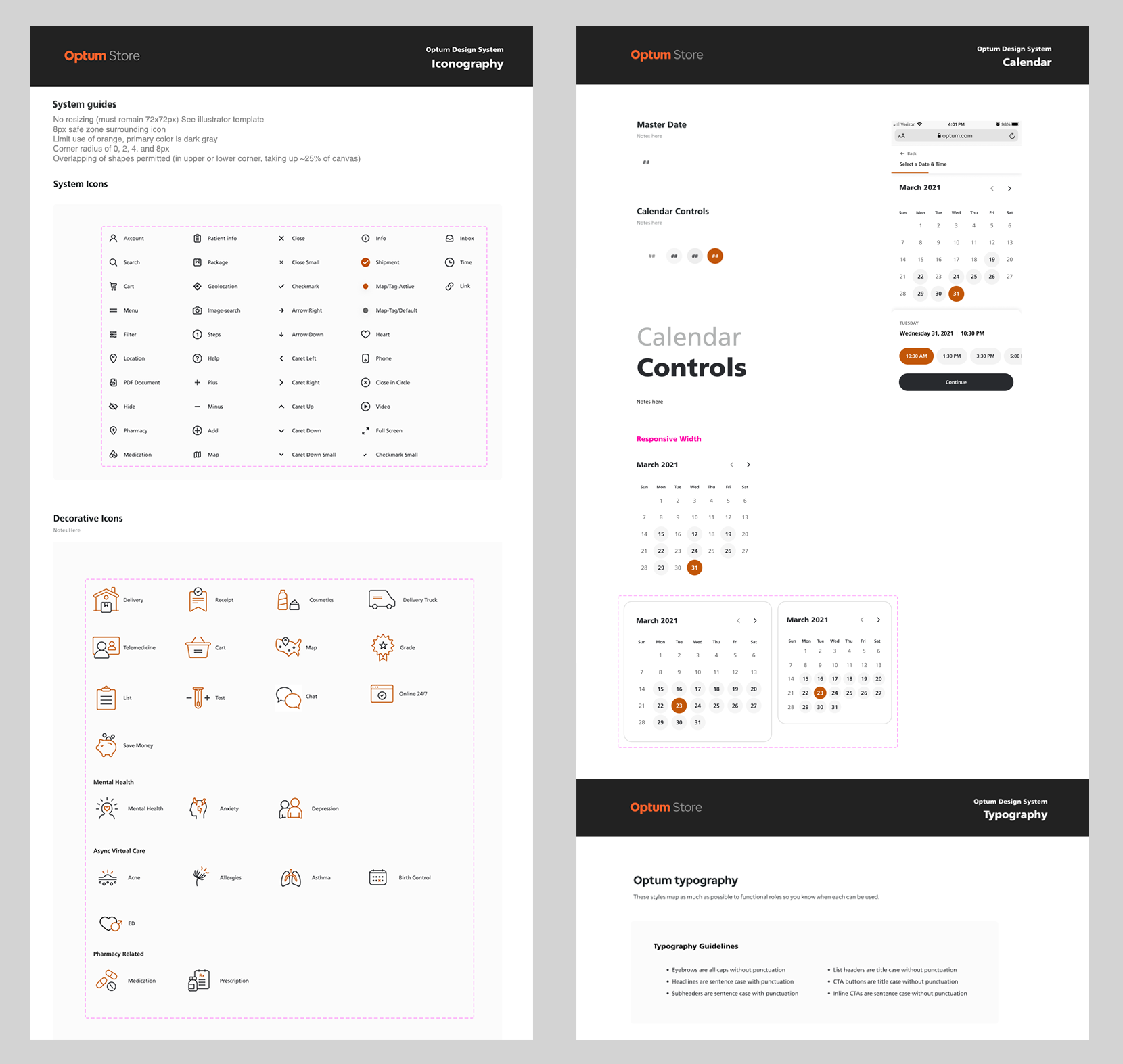
Contributed to Optum’s standard atomic system: Atoms/Molecules/Organisms/Templates/Pages. Monday mornings were dedicated to updates to DPL and share out’s of sandbox activity—ongoing exploration of DPL elements to fold into collection. Met with parent company (United Health) with regularity to ensure brand and UI cohesion.
ABBREVIATED CASE STUDY — VIRTUAL CARE
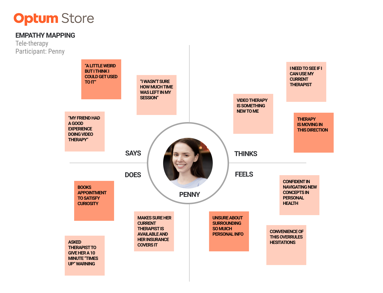
Leveraged UXResearch to help shape product designs—here, participant empathy map from observed sessions of potential users interacting with prototype with callouts of key insights. Additionally at Optum we conducted A/B tests, issued surveys, with perpetual input from cross-functional partners captured in Figma files or decks that showcased upvoted design assets.
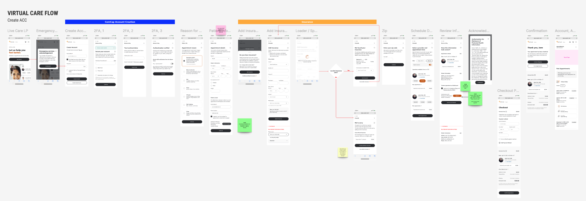
Early flow work: Lo-fi comps further fleshing out booking virtual care. In this use case, after first establishing new account and adding insurance.
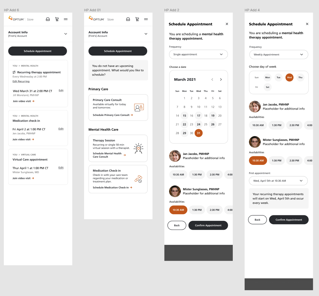
After another round of testing/research to help vet decisions, the more refined flows: Mobile break point for scheduling provider appointment
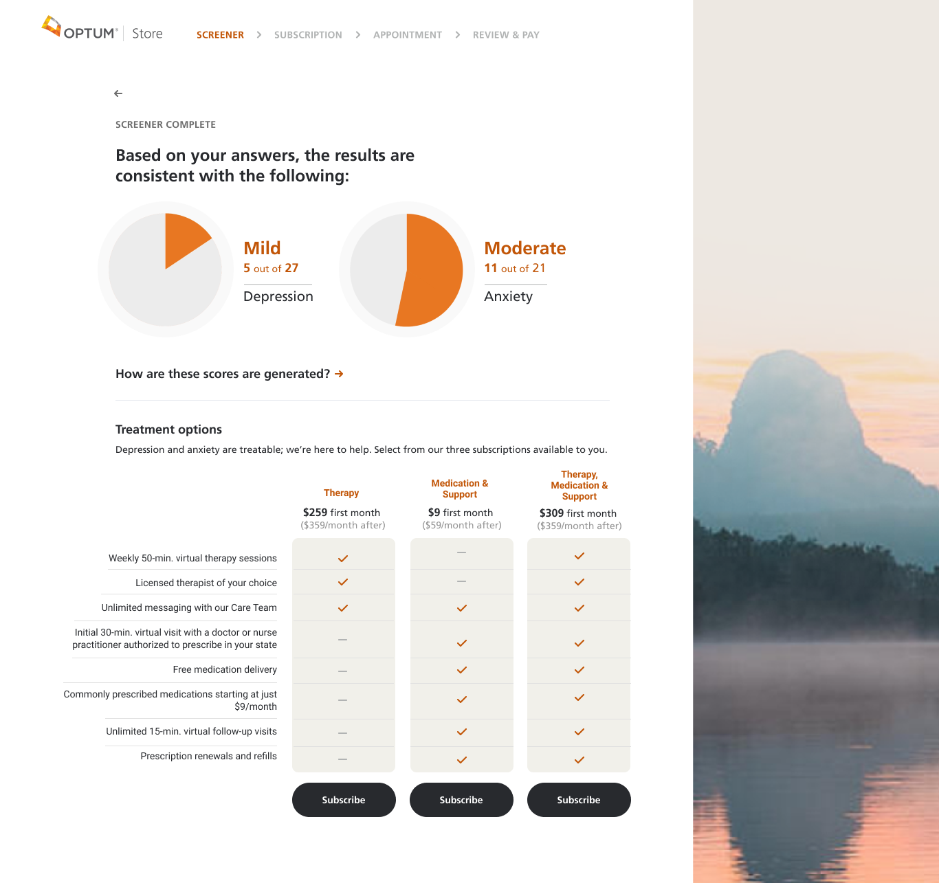
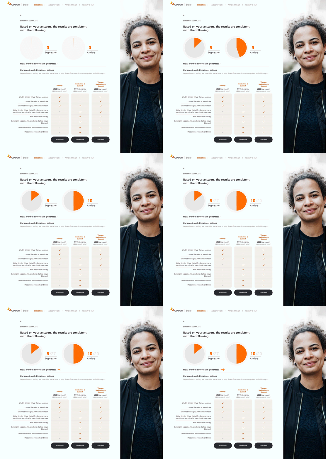
After stepping through a screening flow, users would be issued an assessment of two mental health attributes— levels of anxiety and depression. Scores employ PHQ-9 and GAD-7 are standardized measures used to monitor clinical outcomes as part of Efficacy’s Clinical Governance strategy. These are increasingly used in robust mental health research to indicate a diagnosis, a classification of severity and outcome monitoring within national CBT therapy services. Packages of subscription-based care with comparison chart gave users a convenient way to assess their commitment comfort.
“How are these scores generated” pop-over, across breakpoints. UXR told us users needed access to information that vetted our processes, building trust and confidence in service. A help line was established to answer questions as well based on this research.
CART FLOWS
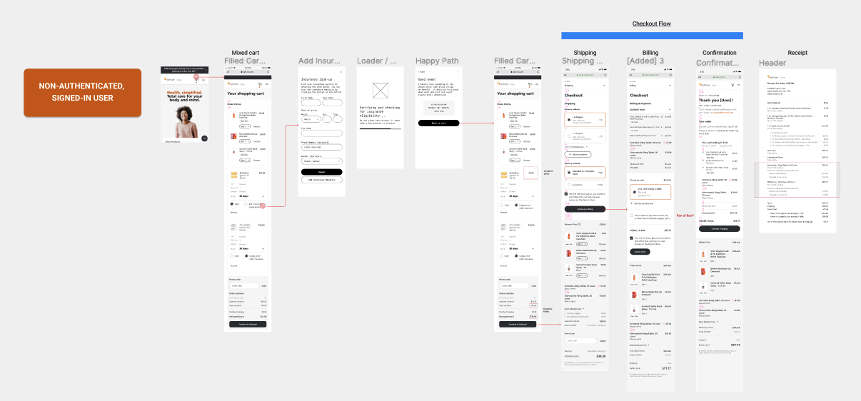
Participated in significant refinements to cart flow and address new user scenarios—the adding and application of insurance while purchasing OTC products and booking provider visits.
Cart flow work: Accessing mixed cart (OTC products, medication) off HP, adding insurance before checkout flow.
EVOLUTION OF A PAGE
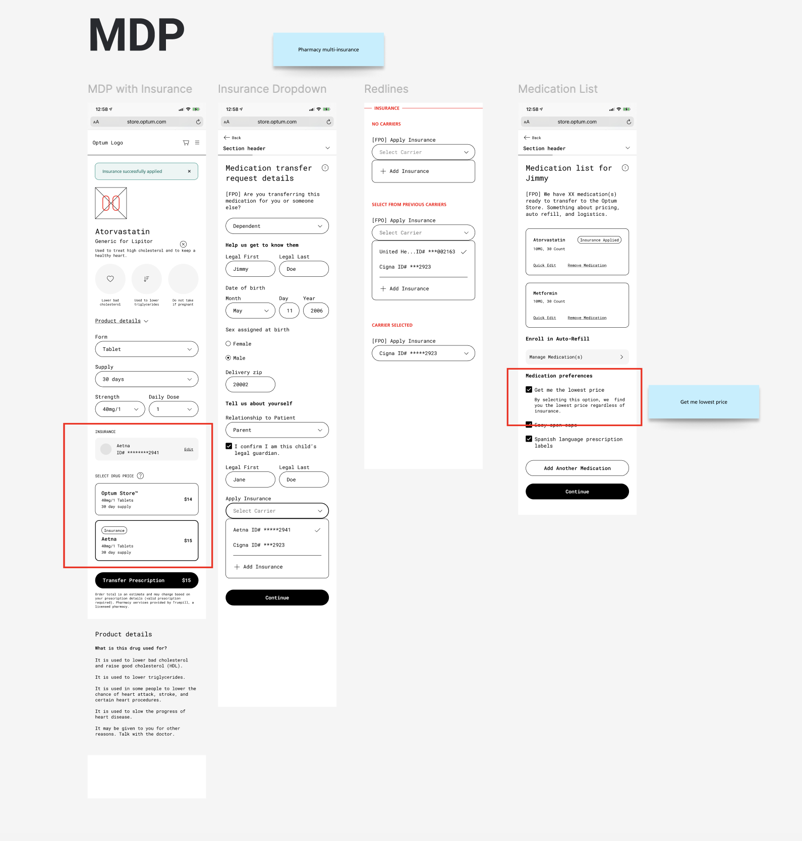
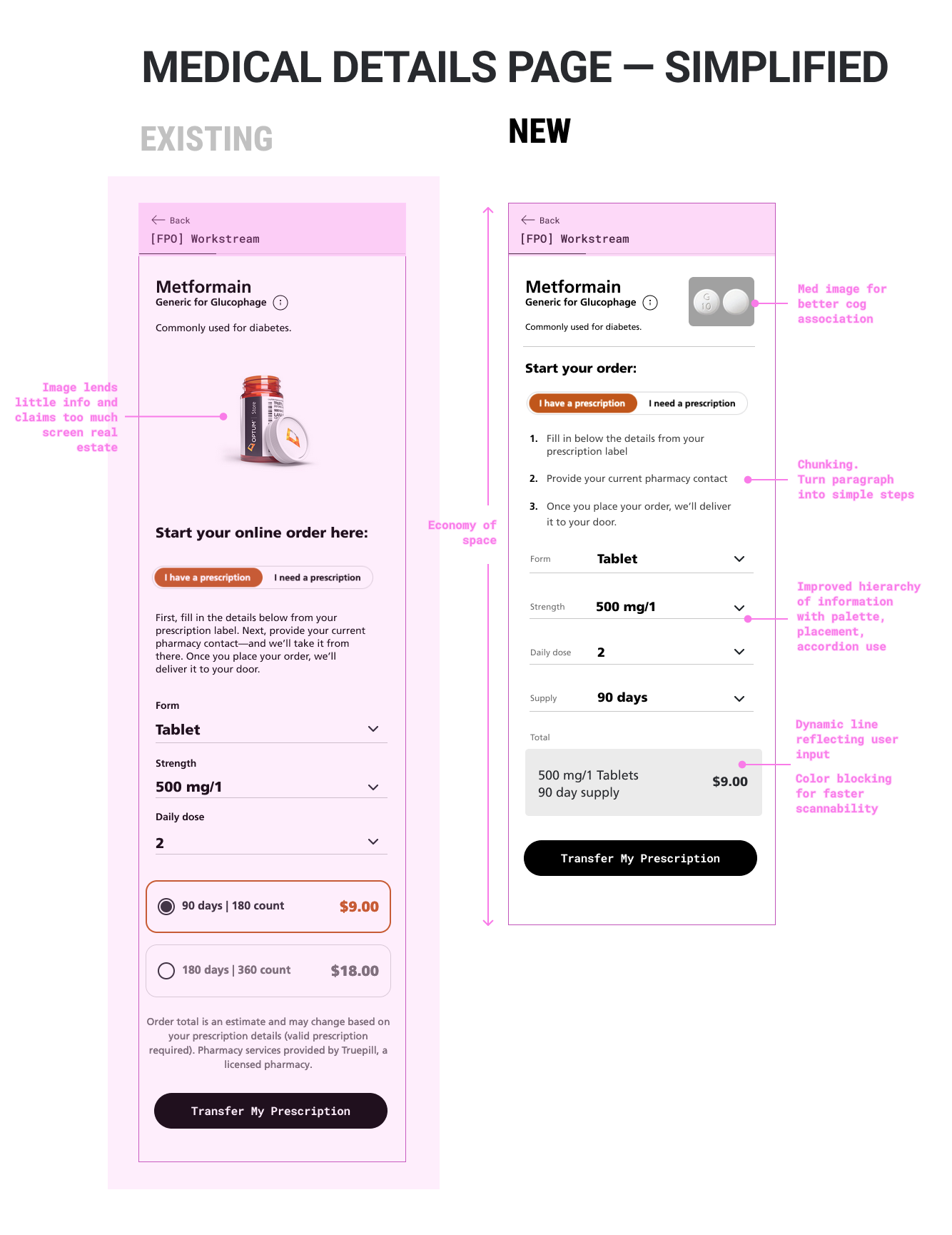
Early wireframes, audits and upgrades to key, high-traffic pages in flows. (ie Medical Details Page). Design intent:
Reduce cognitive load by removal of extraneous elements and better chunking of salient information, breaking paragraph into digestible steps
Improve page hierarchy with palette and layout to improve “scannability” of page
Use of dynamic elements to give pulse to page
utilize product imagery for better association and orientation of intended end result
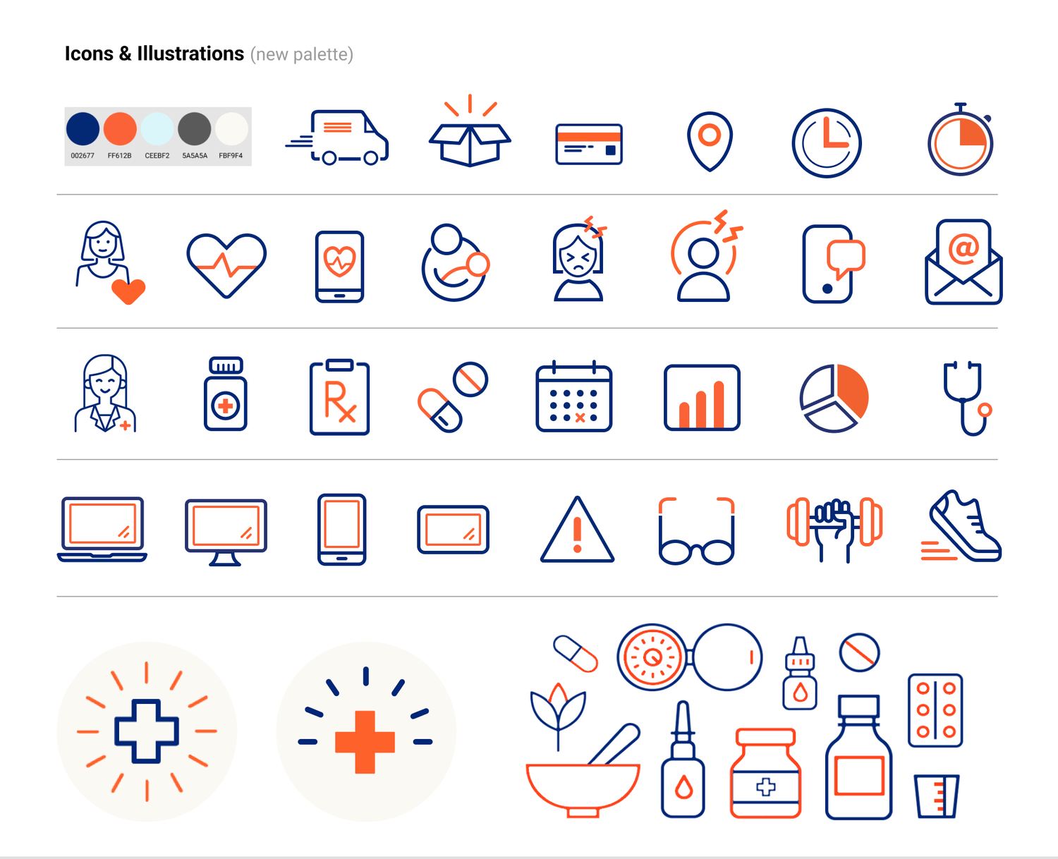
Iconography
Regularly crafted icons and other graphical elements for the evolving DPL.
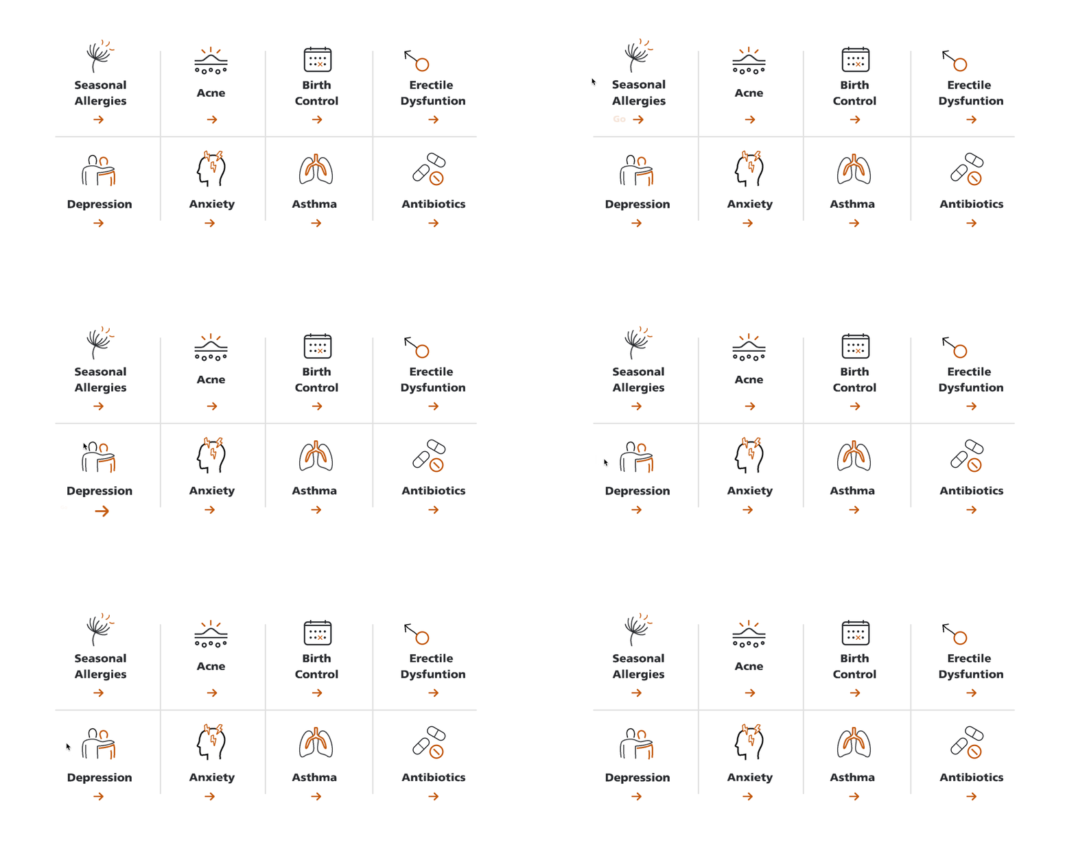
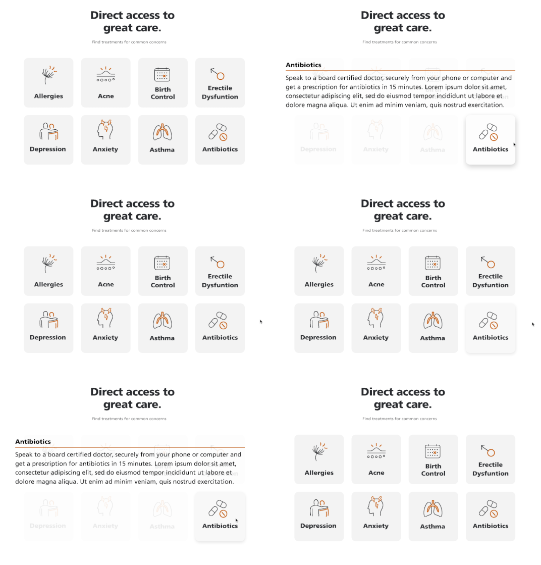
Proof-of-concepts—animated icons/modules on rollover. In an effort to bring some “kinetic flourish” and assure quick access to info in the interface I generated animated versions of HP components.
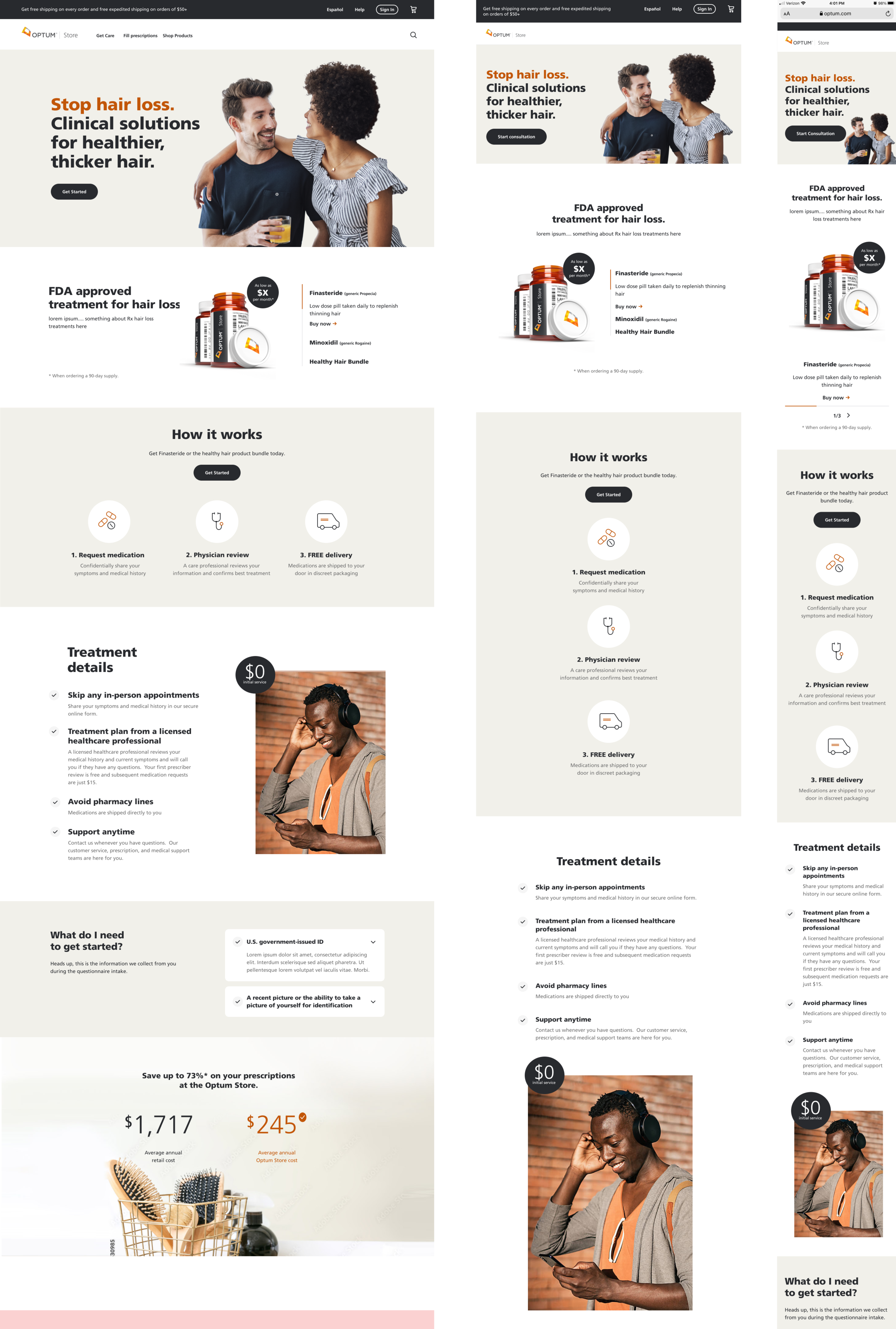
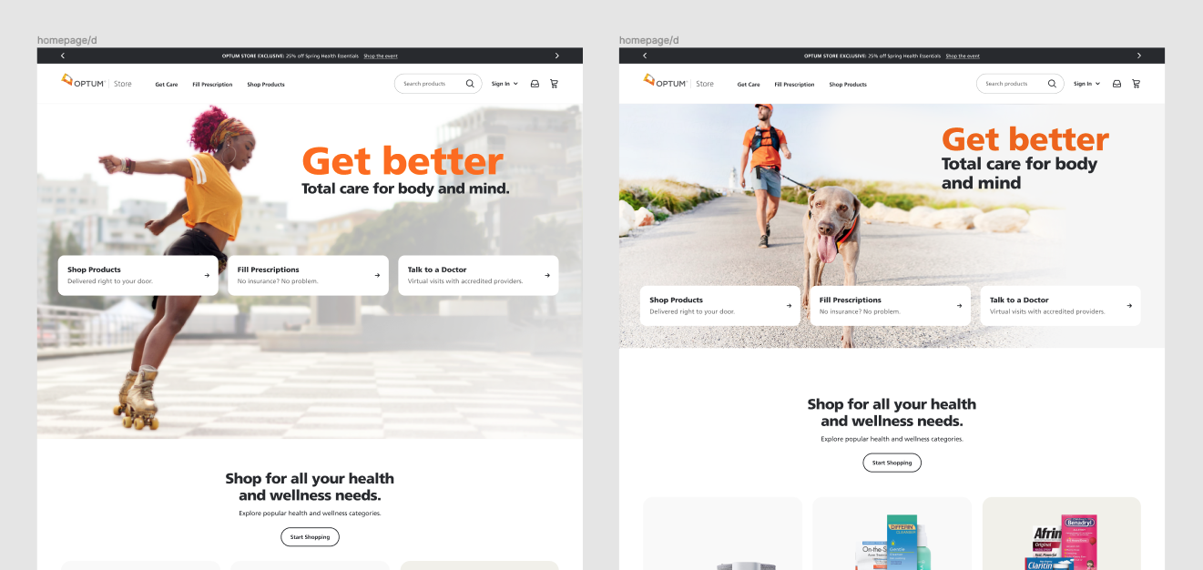
Landing pages—page structure, hero imagery, iconography, and layout of promotional “modules”—across 3 breakpoints—promoting latest products, treatments, and services.
Async Care across breakpoints
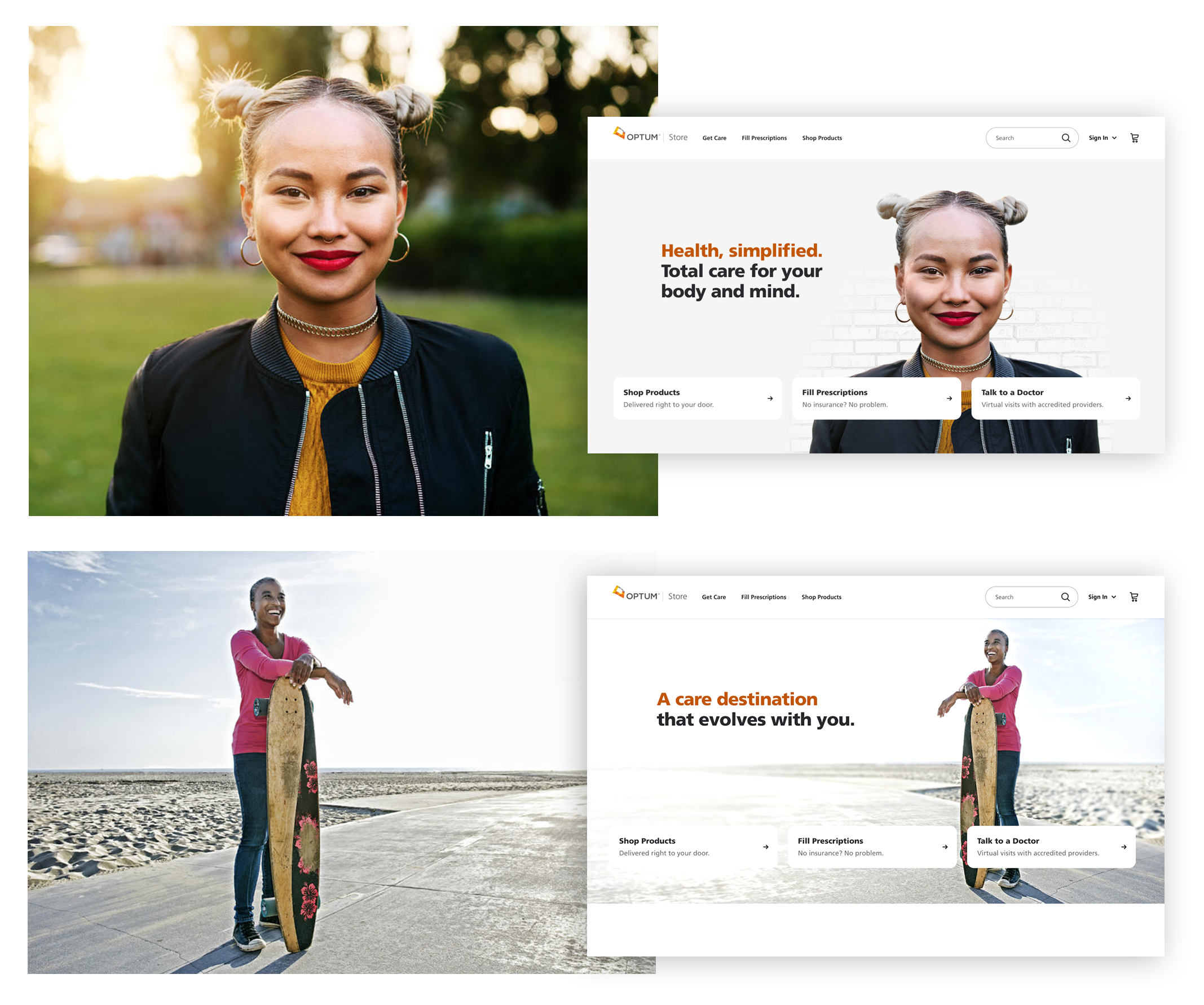
Designed landing pages for expanding treatments offered at Optum. Role: layout iterations, How-It-Works diagrams, copy finessing, iconography, photo selection and editing.
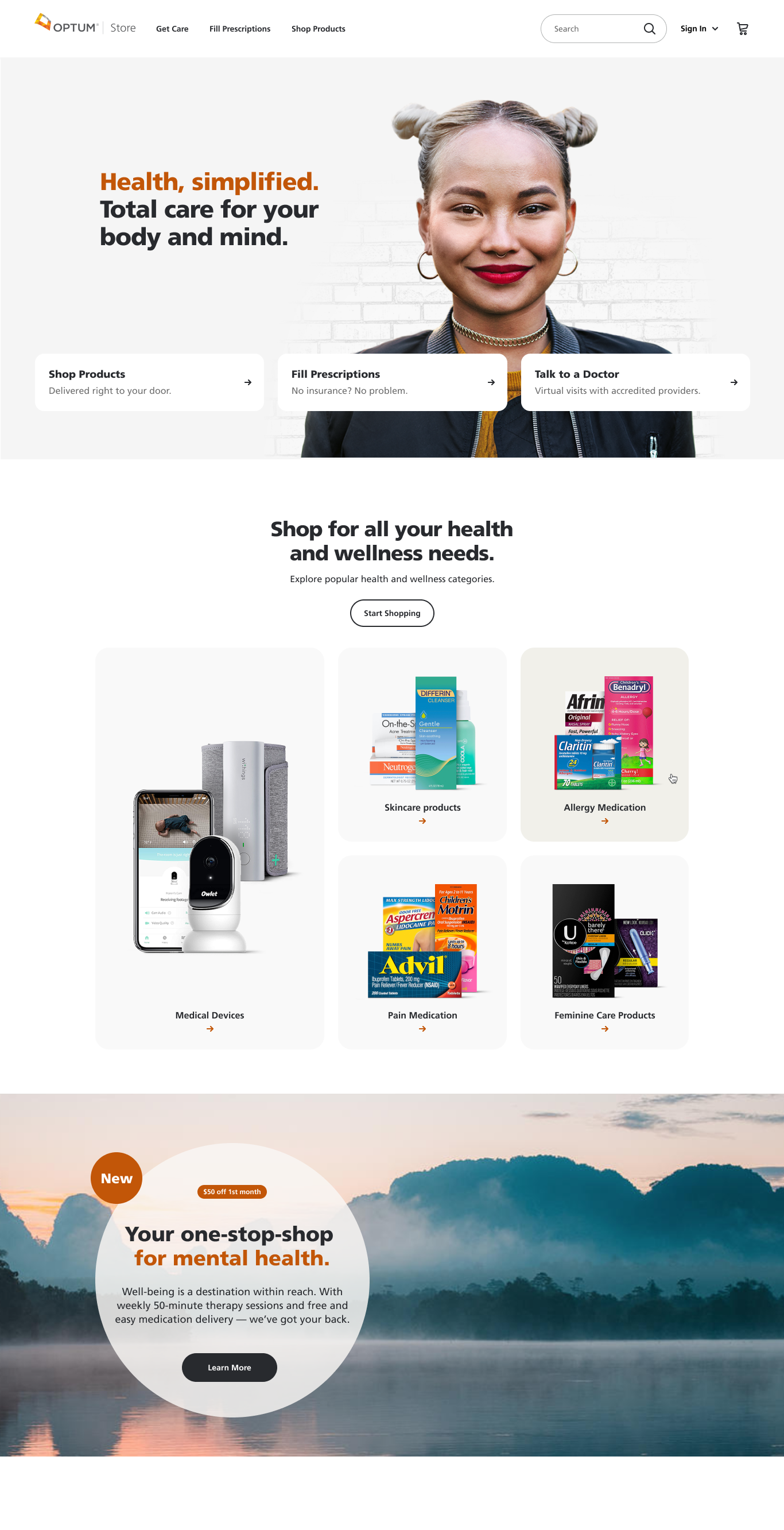
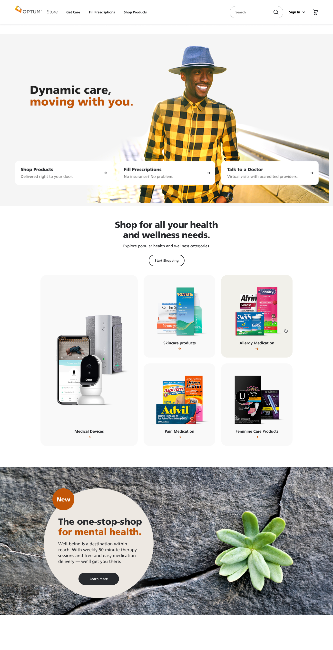
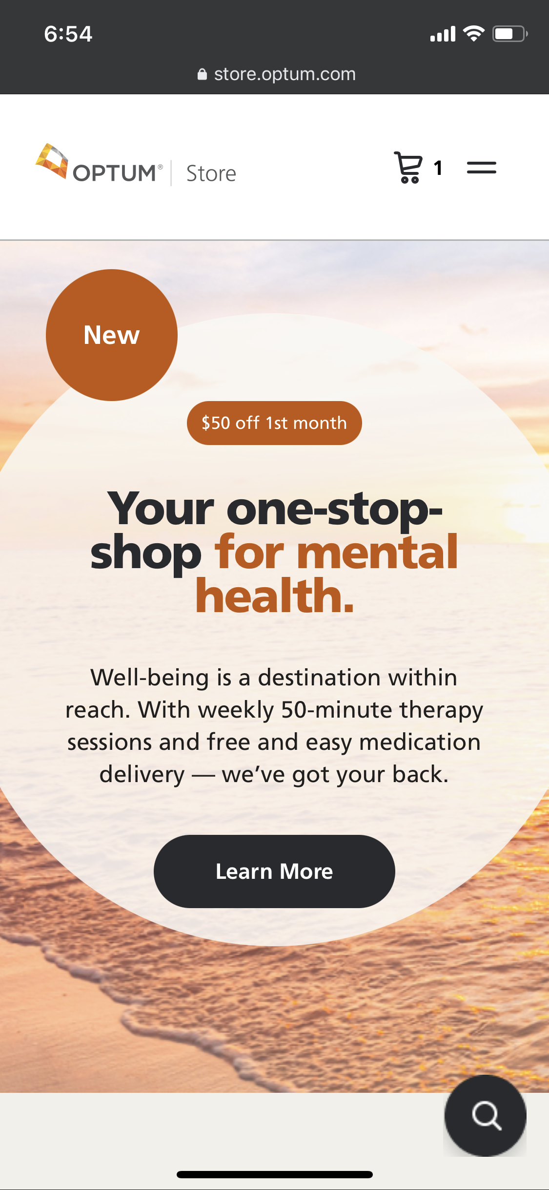
Home page landing w/ hero treatments and modules introducing new mental health services.
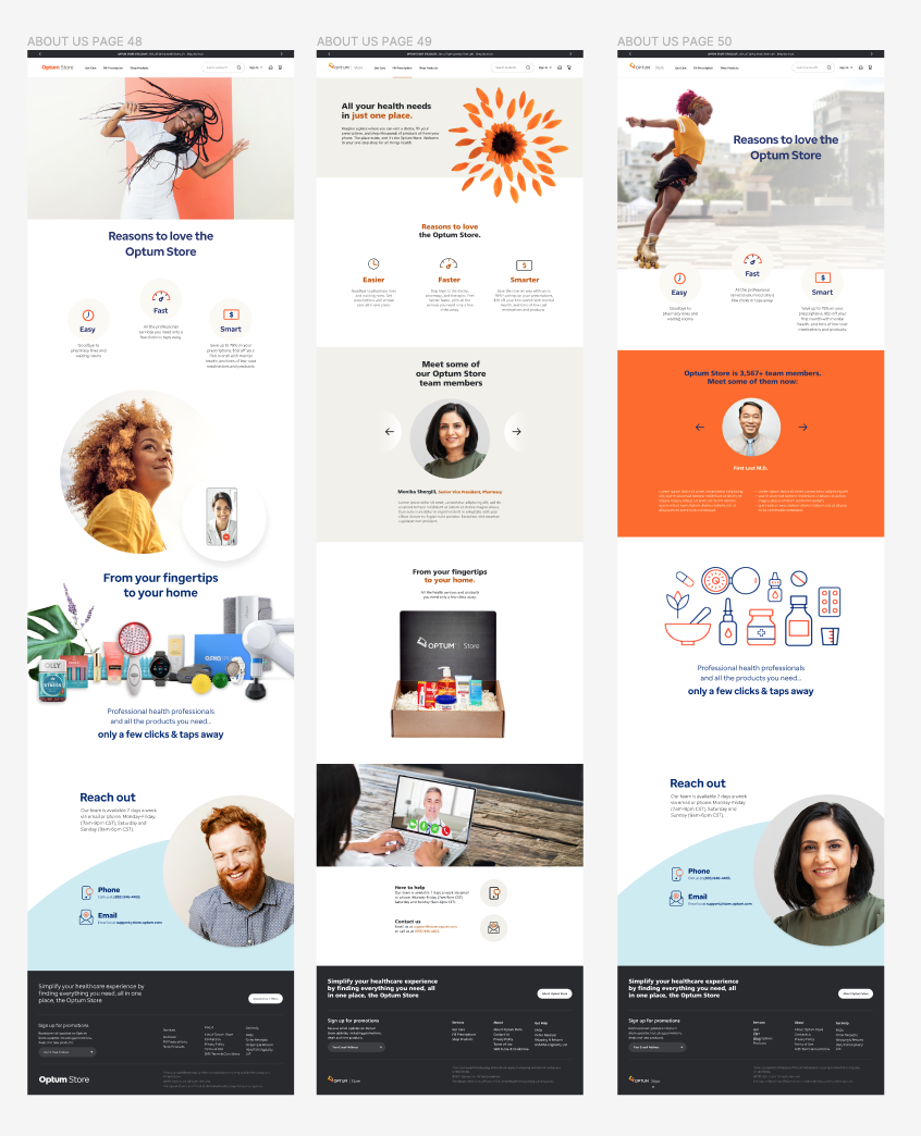
Refresh of About Us page — layout, copy writing, iconography.
Store Landing Page explorations—photo sourcing/editing, copy finessing, layout
Assorted layout components, mental health screener pages with animated builds
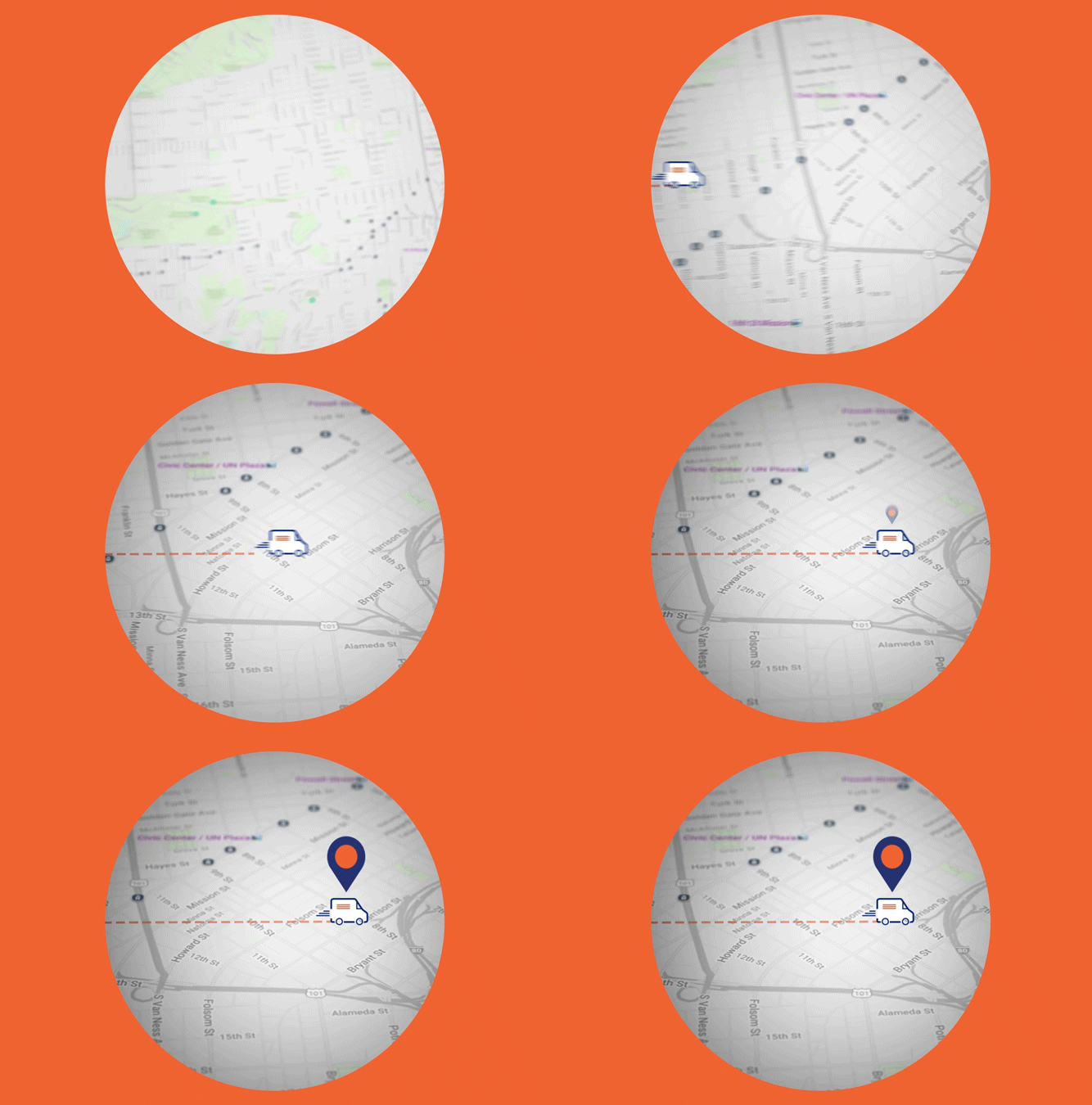
Introduced motion and and animated builds to the otherwise static pages, bringing some pulse to the pages and overall UX.
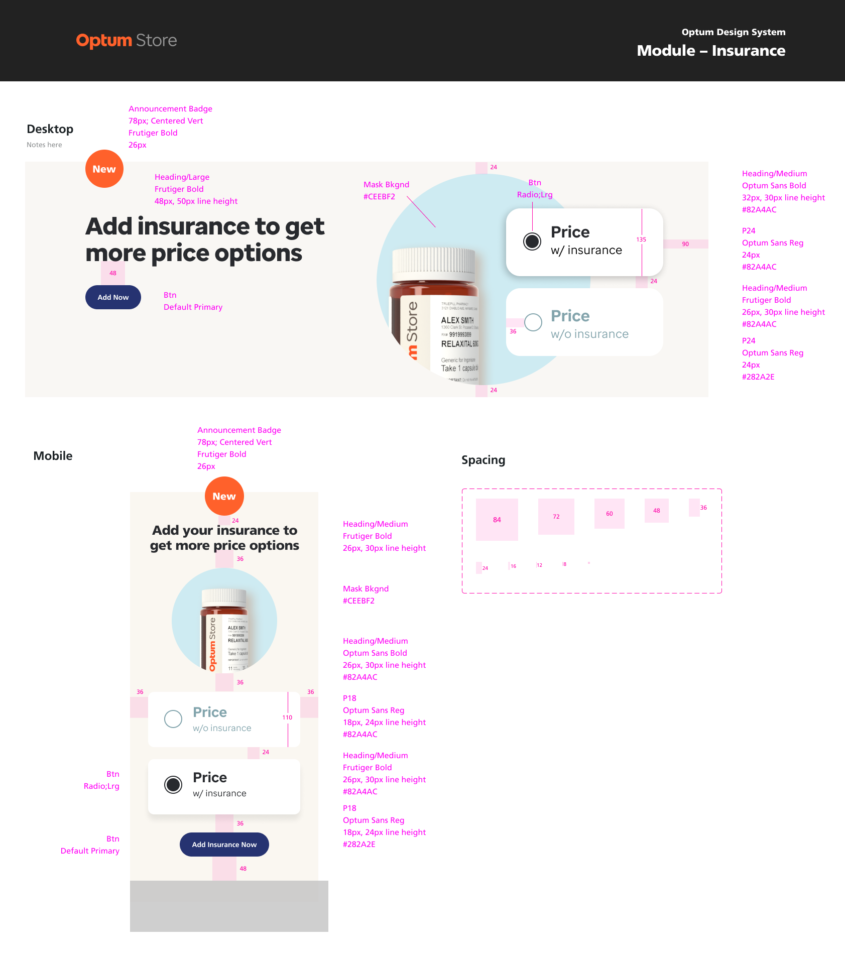
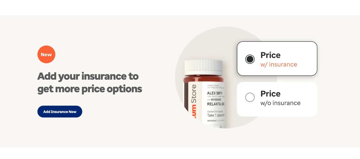
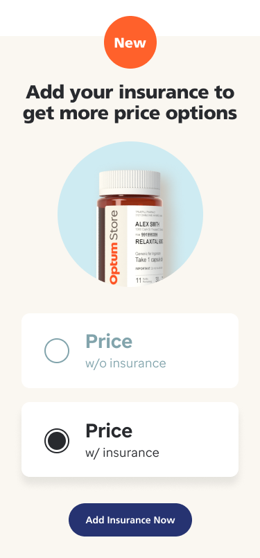
Modules announcing new insurance pricing for users, pulling forward new UI components to aid discovery of this new valuable service.
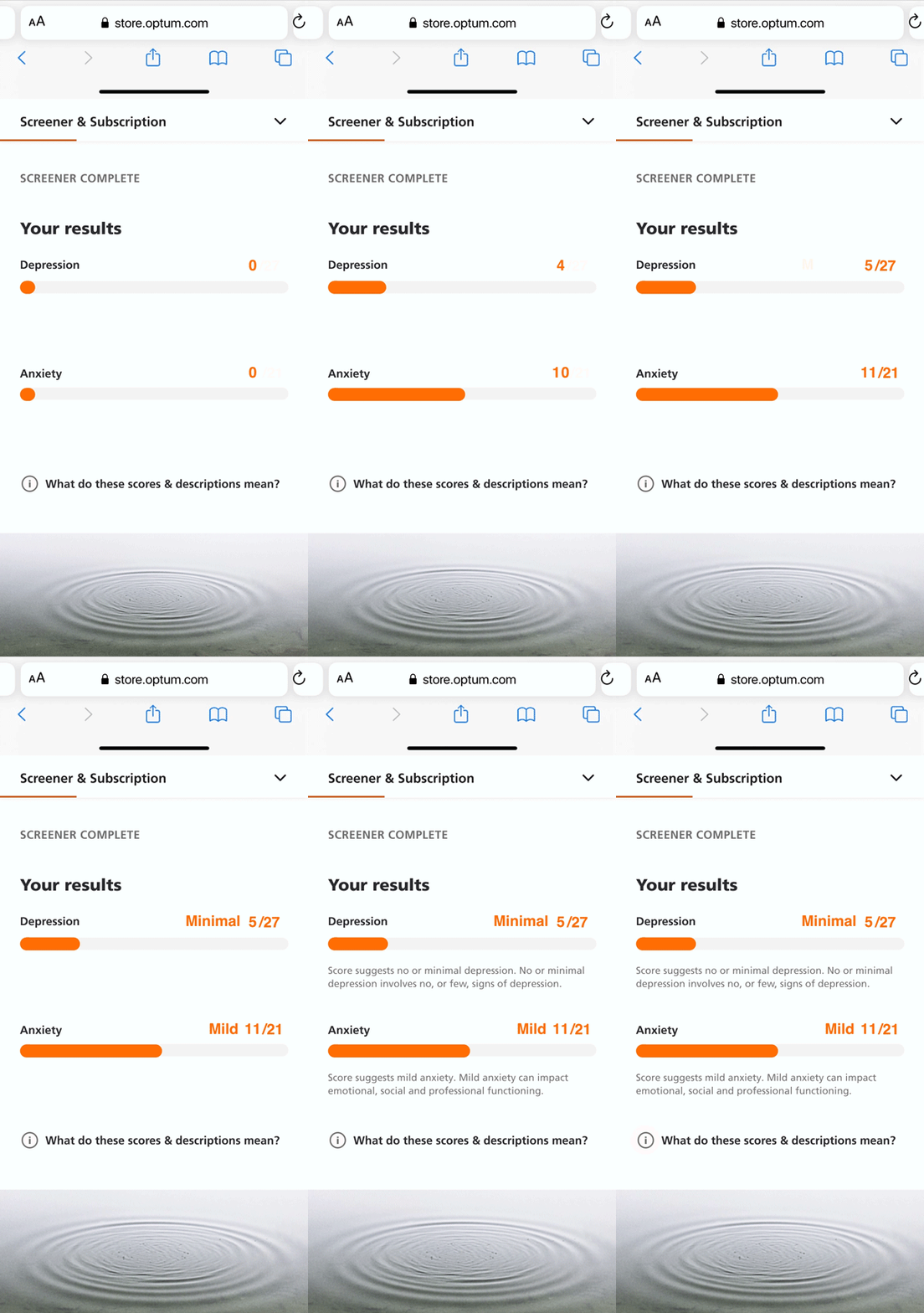
Mobile mental—module for discovery; results page after screening flow. Animated for more engaging UX.
Results page—dsktop. Animated proof-of-concept graphs (After Effects).
How-to animations
Generated a series of short videos/animations to provide users succinct info about prescription managment. Tools: Principle, AfterEffects
Marketing
Heavy involvement with marketing to generate cohesive collateral that was on-brand and helped discovery of growing ecosystem of product and services—hero graphics, landing pages, email campaigns, social posts, print pieces. Original concepts, layout, animations, and copy writing.
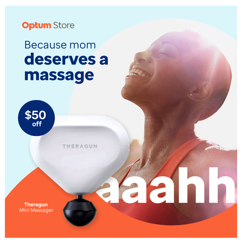
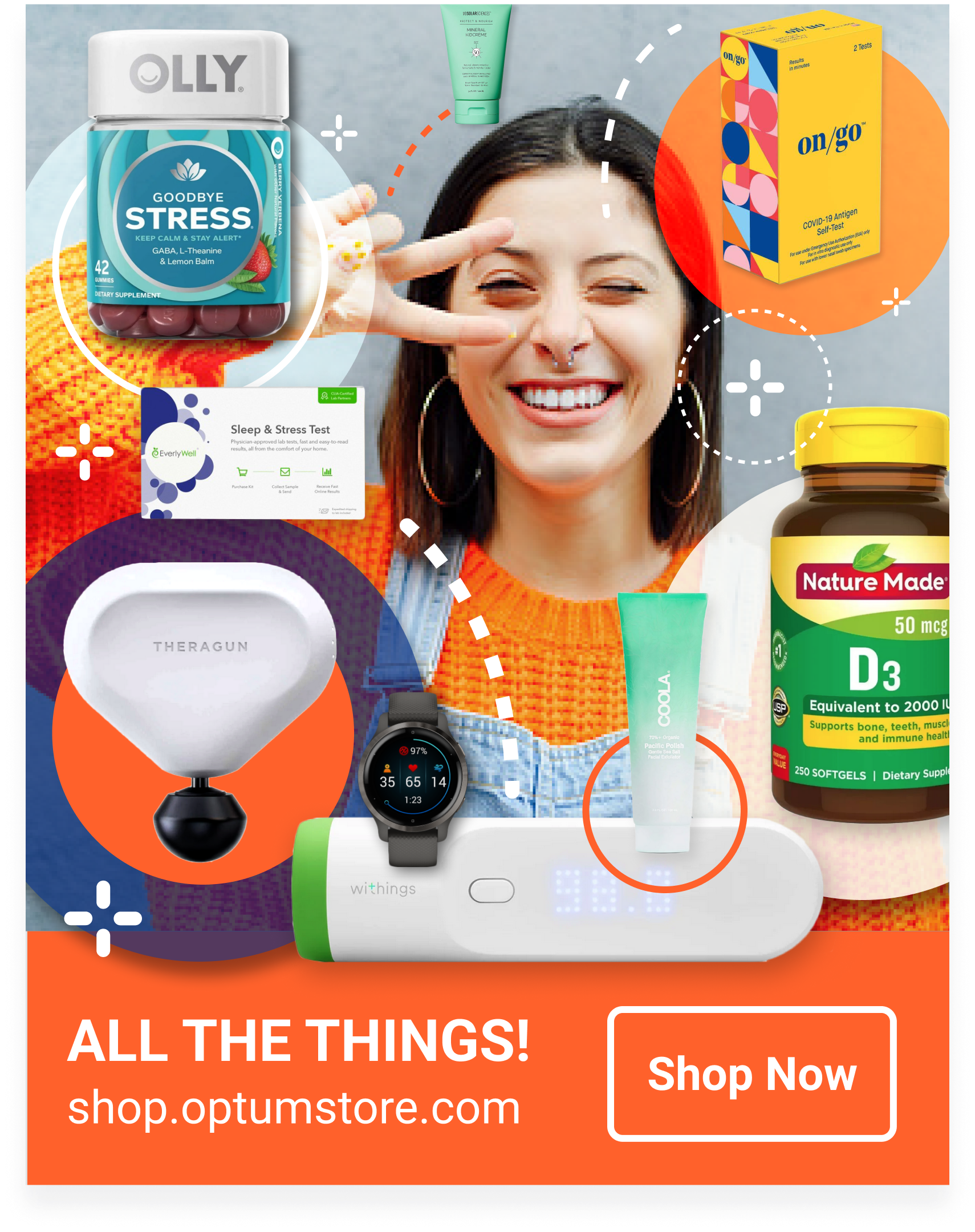
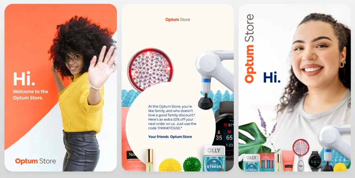
Social posts for Mother’s Day campaign and OTC Store products (maximalist aesthetic to communicate inventory abundance).
Mother’s Day social carousel
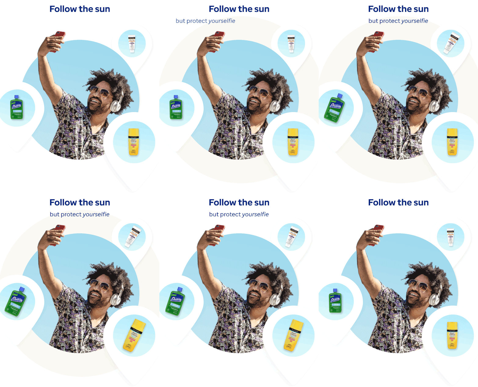
Animated headers for better conversion. Used in marketing emails and social media posts. Tools: Figma & Principle
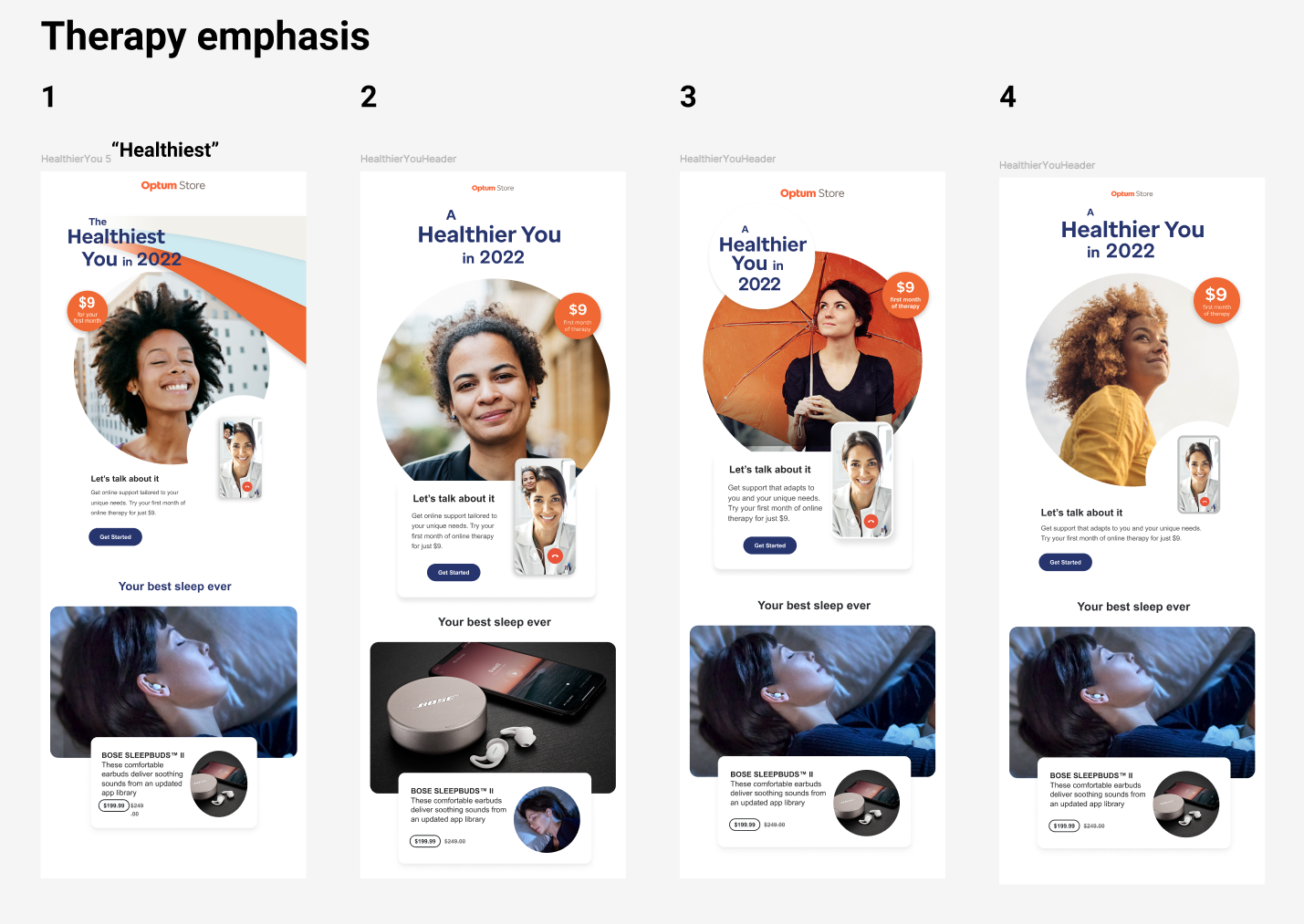
Email headers: Concepts, copy writing, layout, visual finessing, animation to improve conversion.
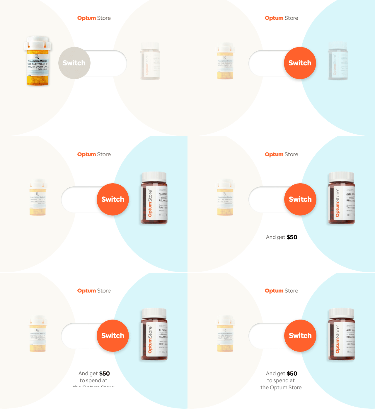
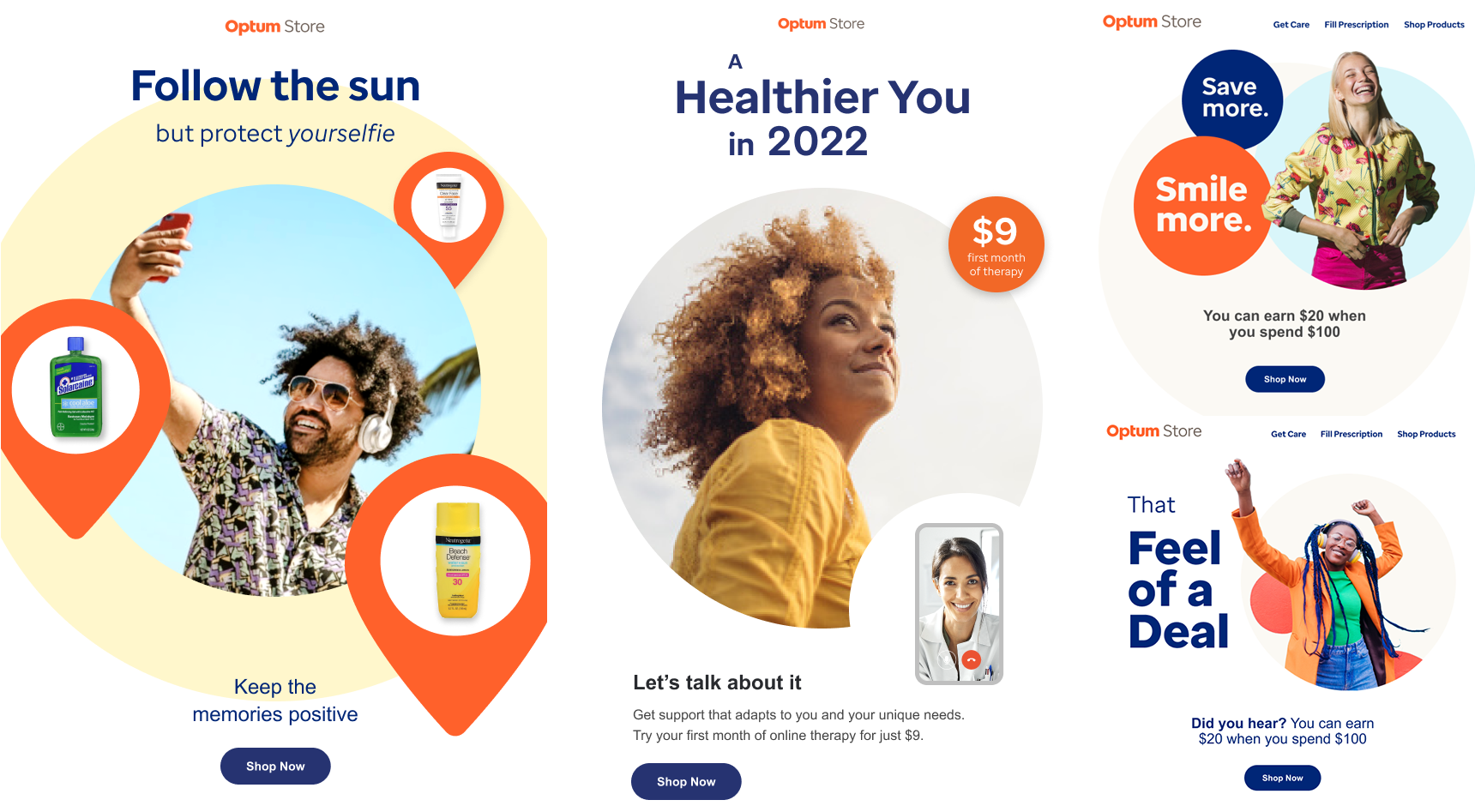
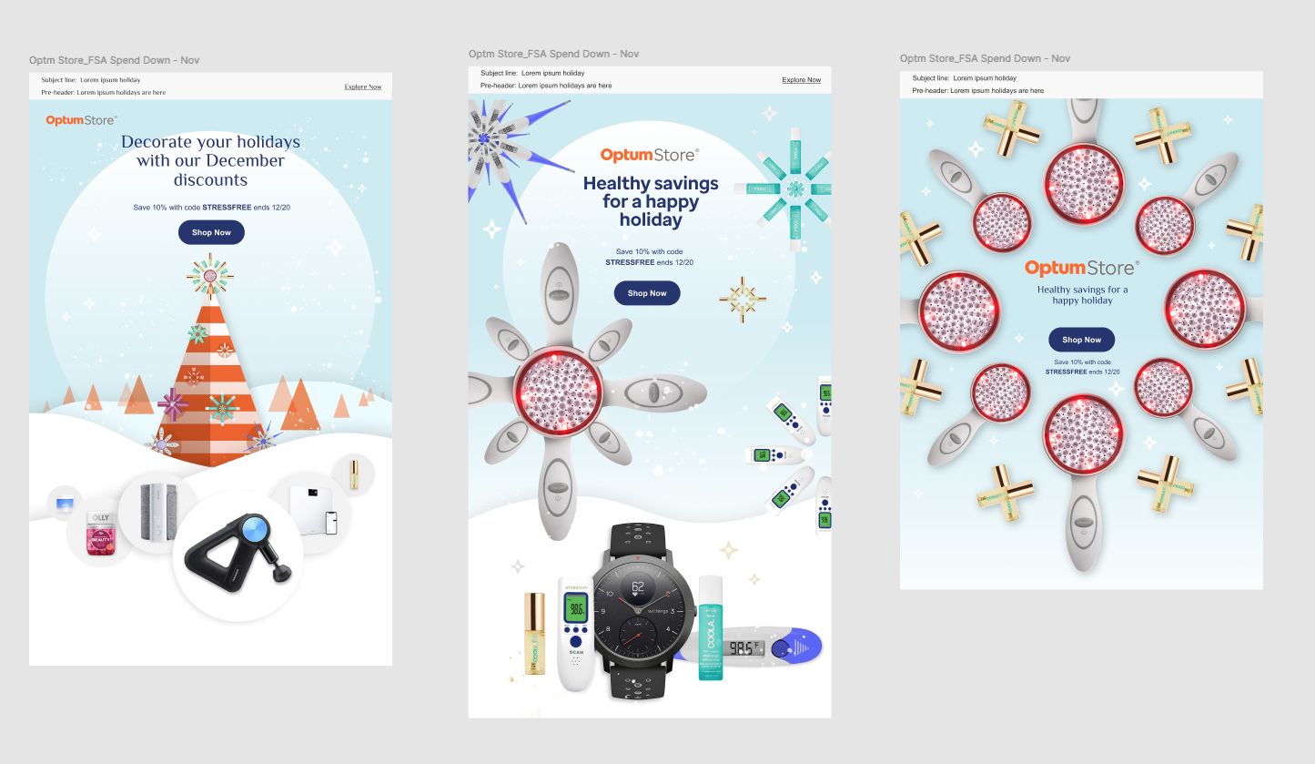
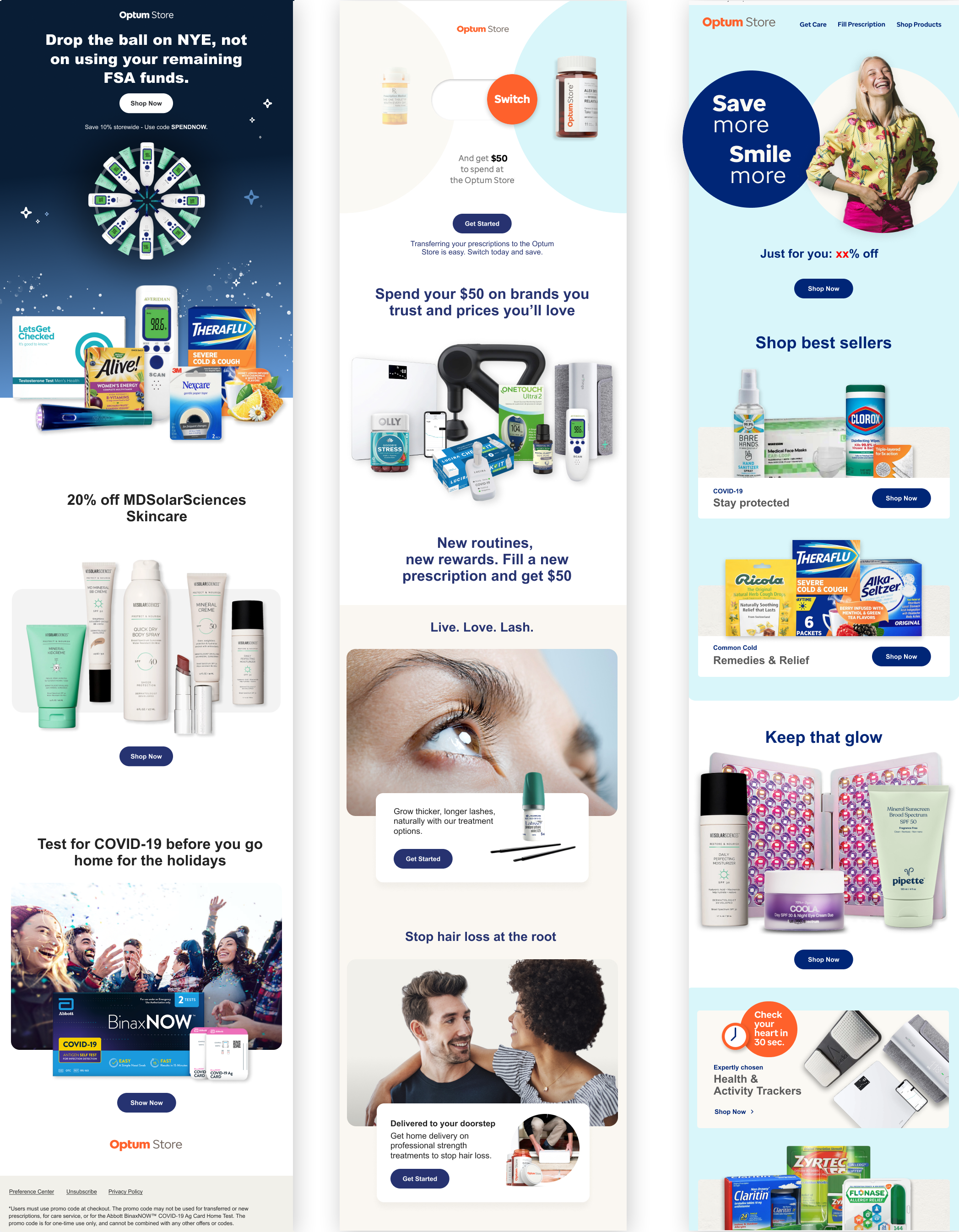
Various email campaigns—Holiday, Switch Pharmacy, Spring. Layout, copy writing, animation.
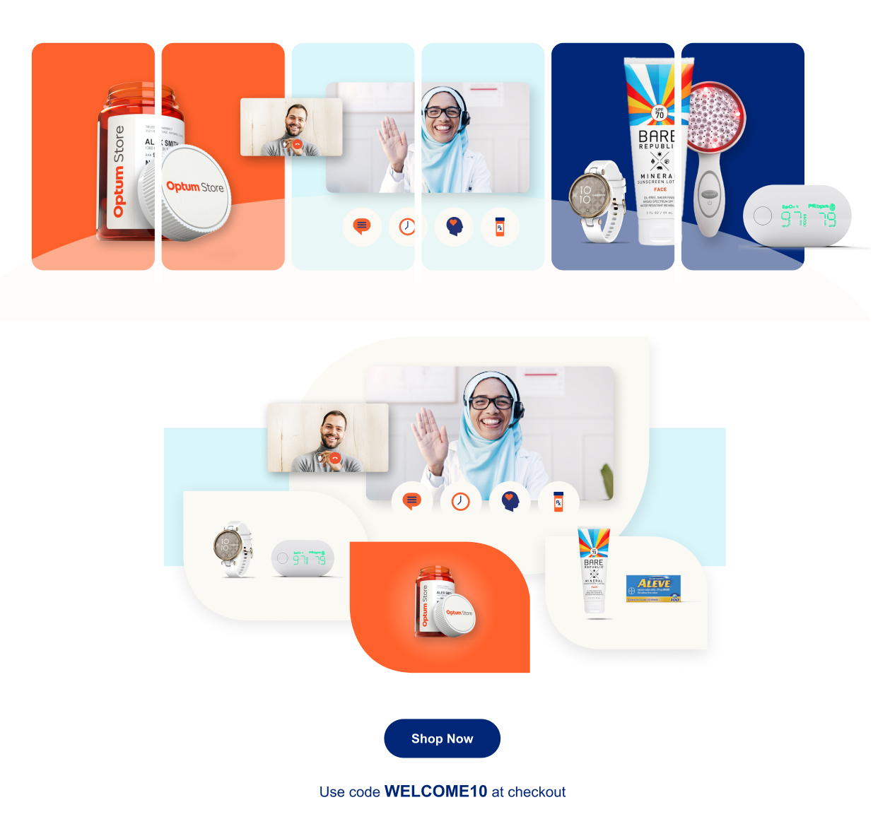
Hero graphic for commerce site and email header for “Welcome to Optum” campaign.
Marketing — Print collateral
Ideation, layout, copy writing, and bespoke visuals.
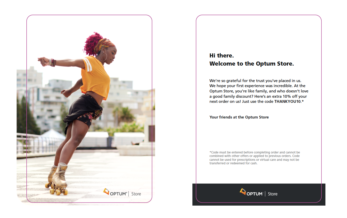
Print—welcome cards included in first delivery to new Optum customers.
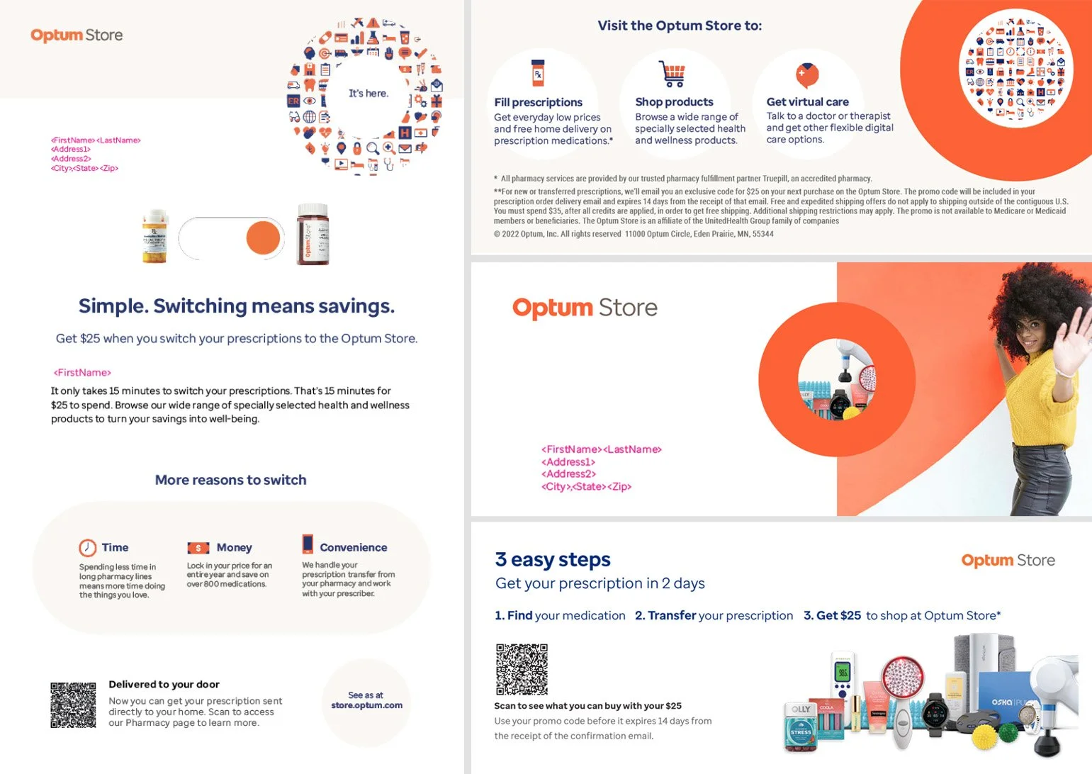
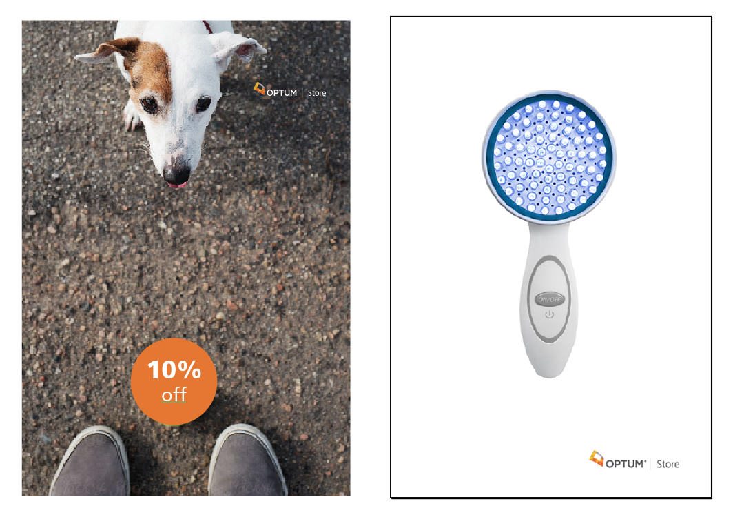
Otpum switch campaign. Mailer and buckslip.
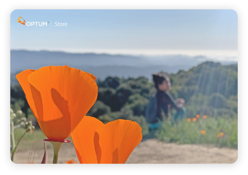
Print collateral—welcome card included in initial order. Original photography.
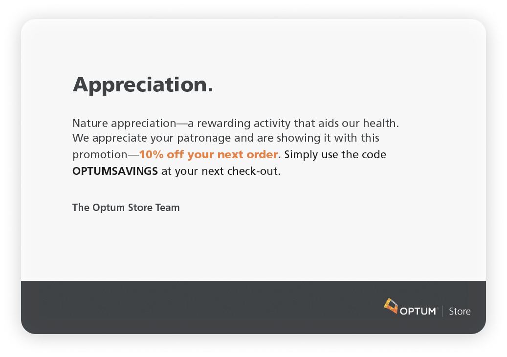
Print collateral — Drop card for Pharmacy
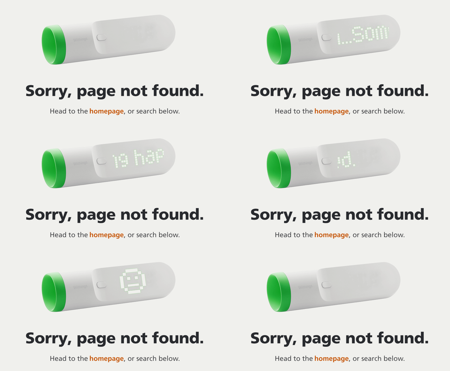
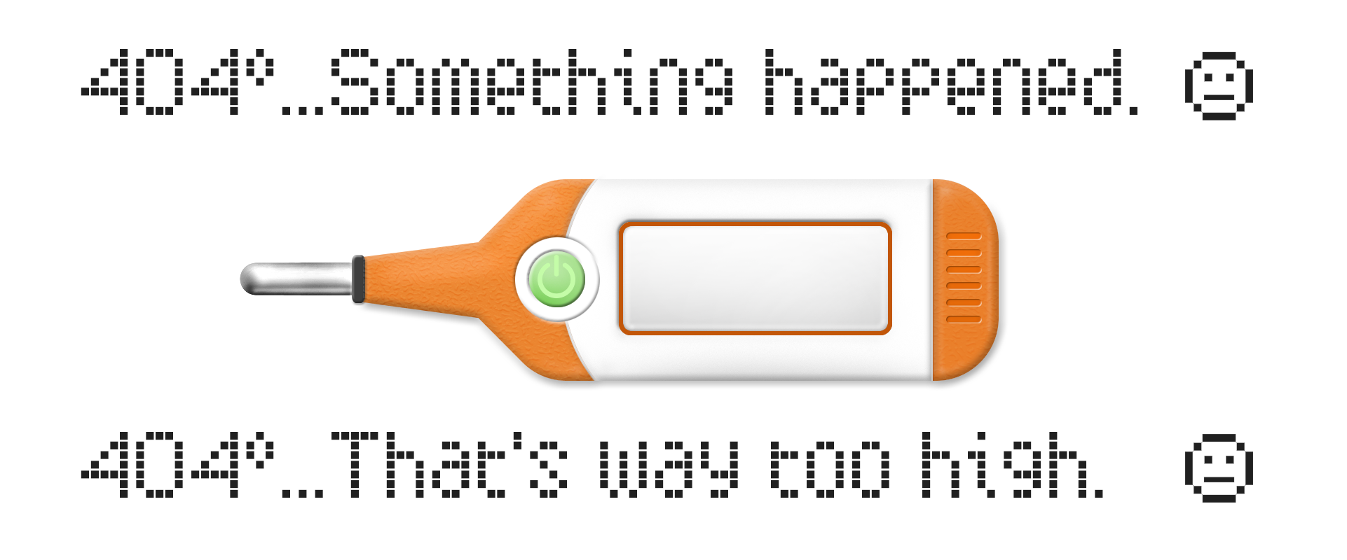
Health-centric 404 pages. Concept, Photoshop, Illustrator, Animation (Principle & After Effects).


