Pulps
Social App; Paris, France
Pulps = French for “octopus”. le poulpe
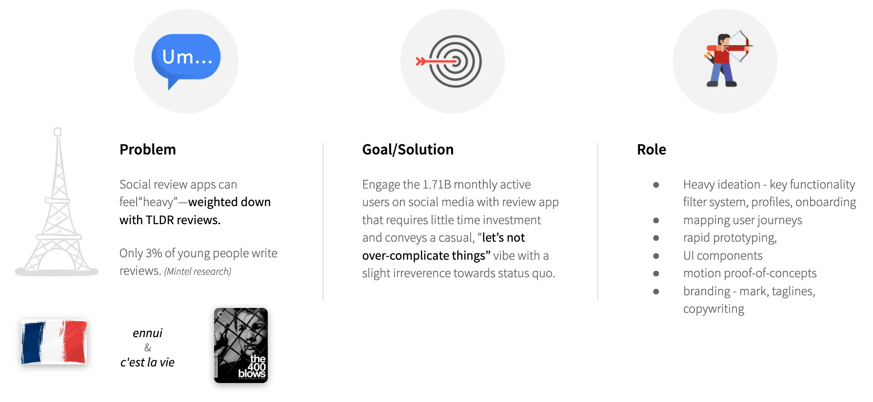
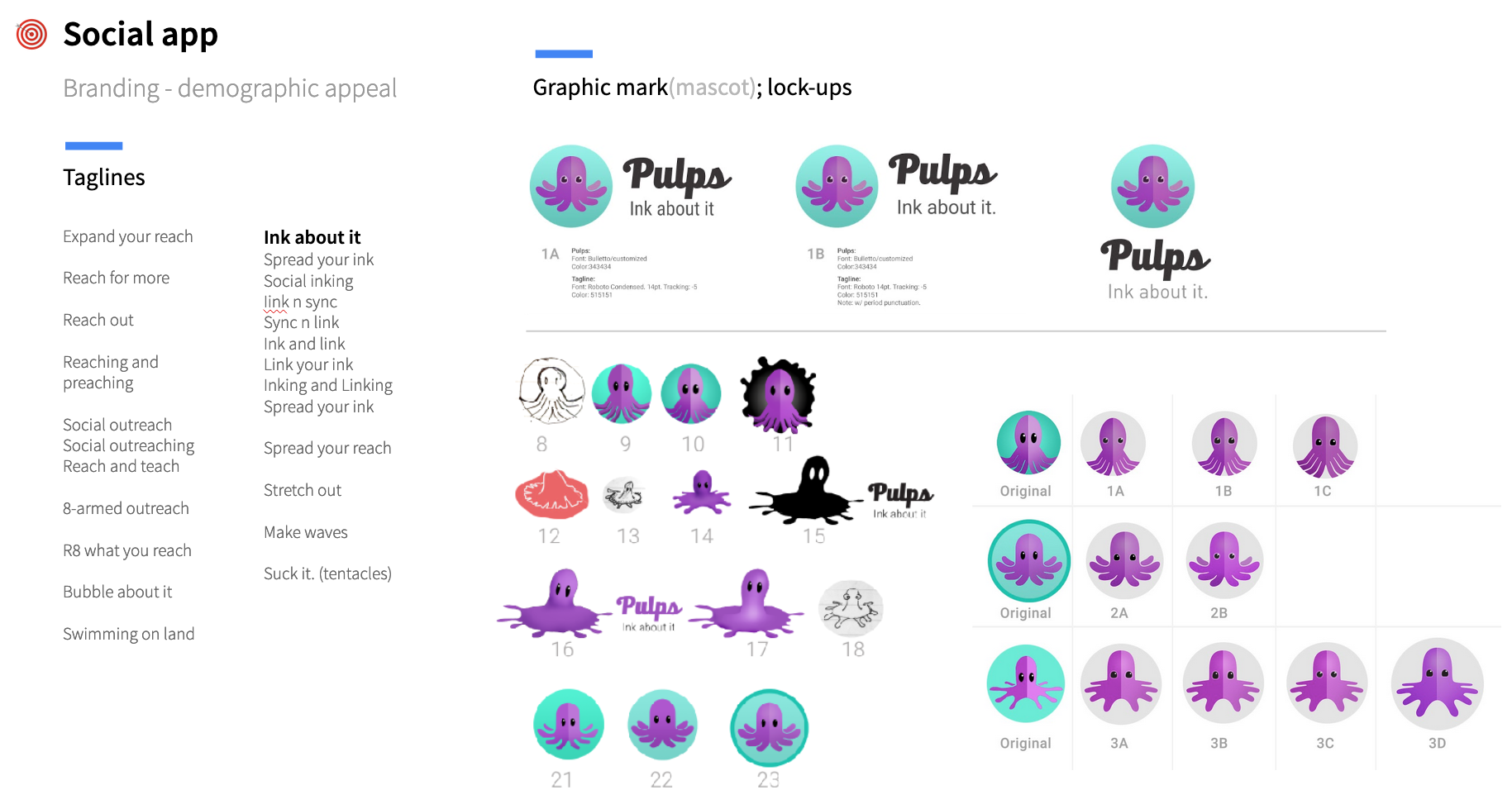
App project I was involved with from the start. It began with a random reach out from two French developers who found my profile on LinkedIn. They had a pdf of a rough concept, explaining basic functionality and intended audience. No aesthetic direction, branding, or digital assets of any kind. I went to work first on the branding. After solidifying the mark, an octopus, it occurred to me we could divine functionality from it and creating a fully cohesive experience that carries logo into function.
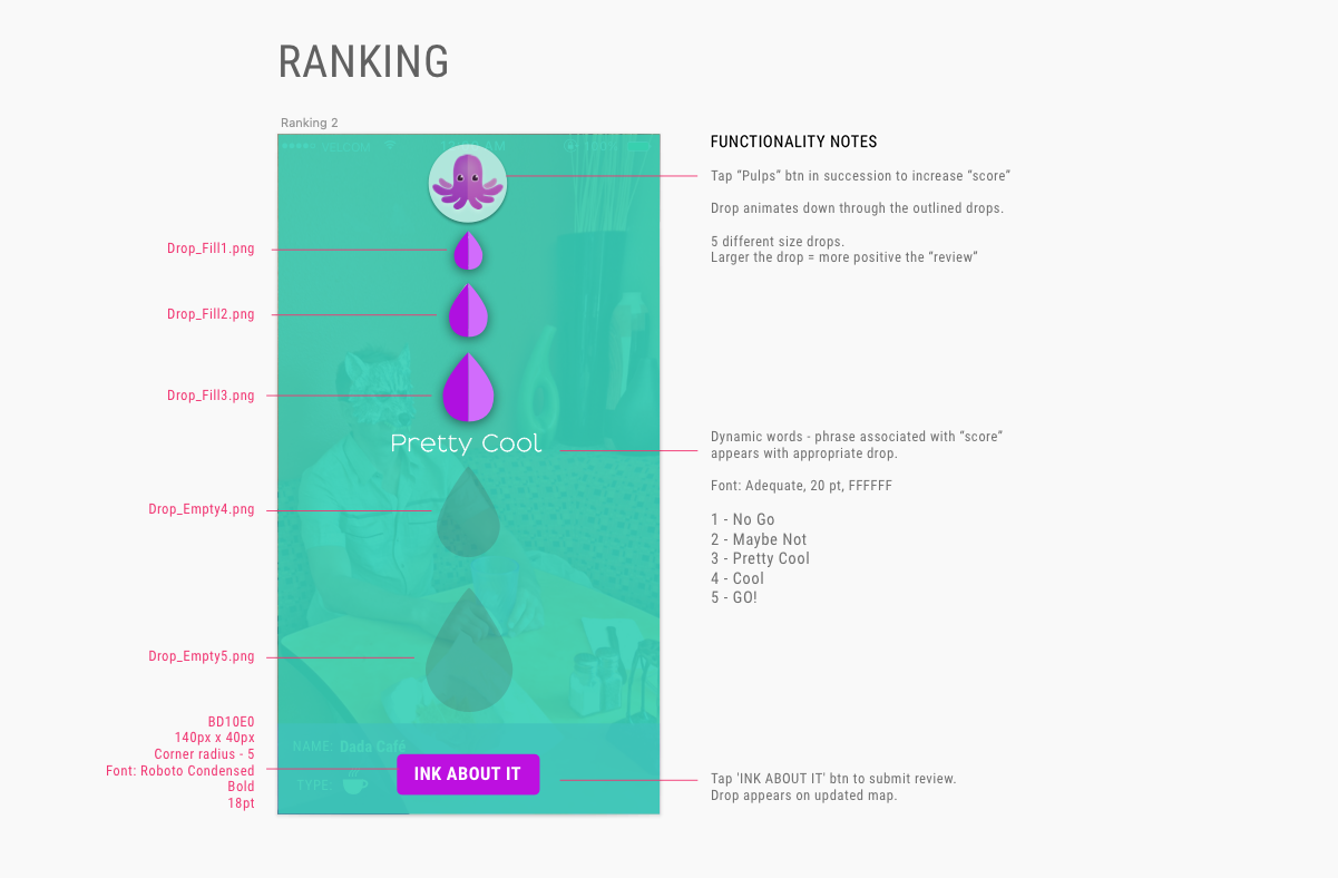
Ink. Octopi emit it. Let’s use that for the ranking system. VOILA! Adding to that was the tagline: Ink about it. Essentially, a user experiences a place and “inks” about it—creating an indelible mark that verifies their visit as well as ranking it. Think about it. Ink about it. The whimsical nature of the app fulfilled the brief, resonating with targeted demographic—young, 20 somethings.
Project anatomy
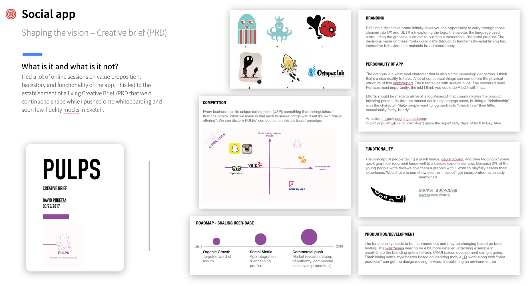
Creative brief (PRD) - North star doc that documented strategies, narrative and development of the app
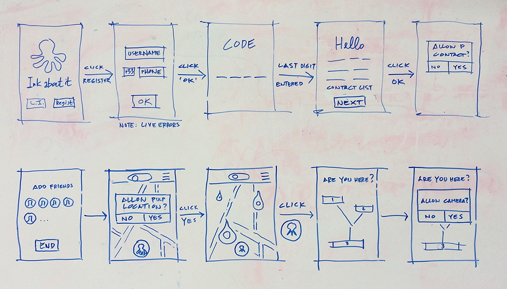
Whiteboard ideation/flow
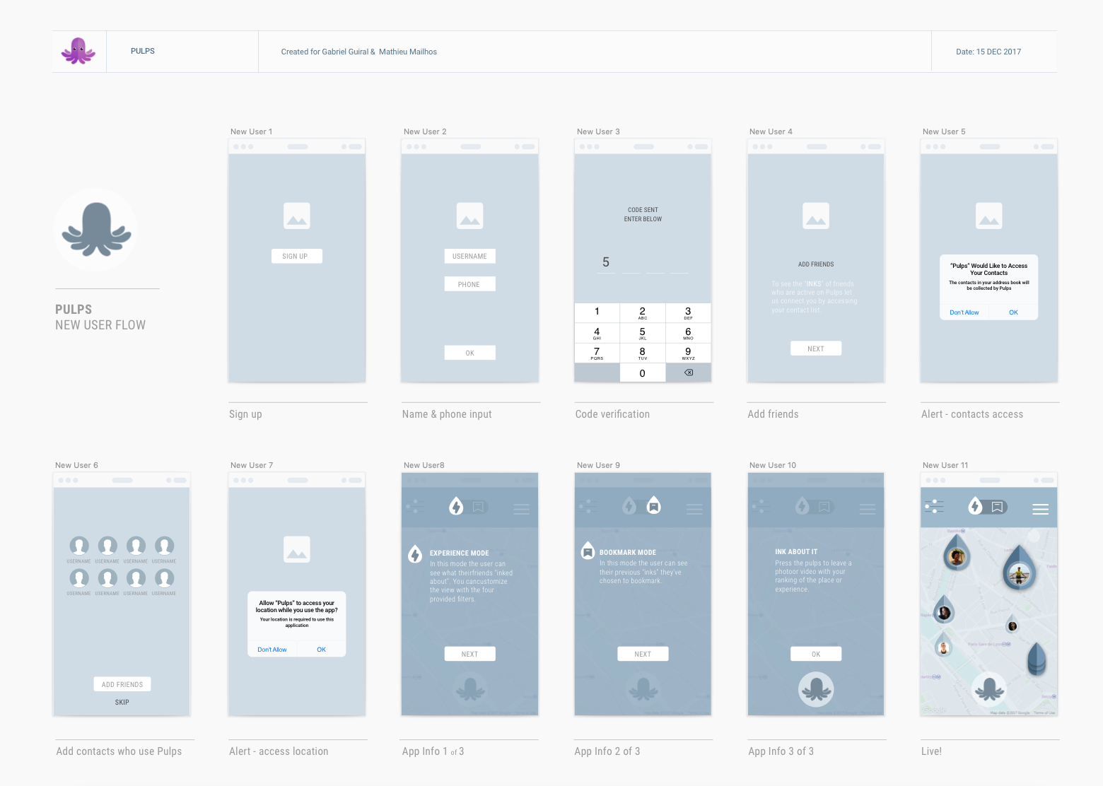
Flow - New User
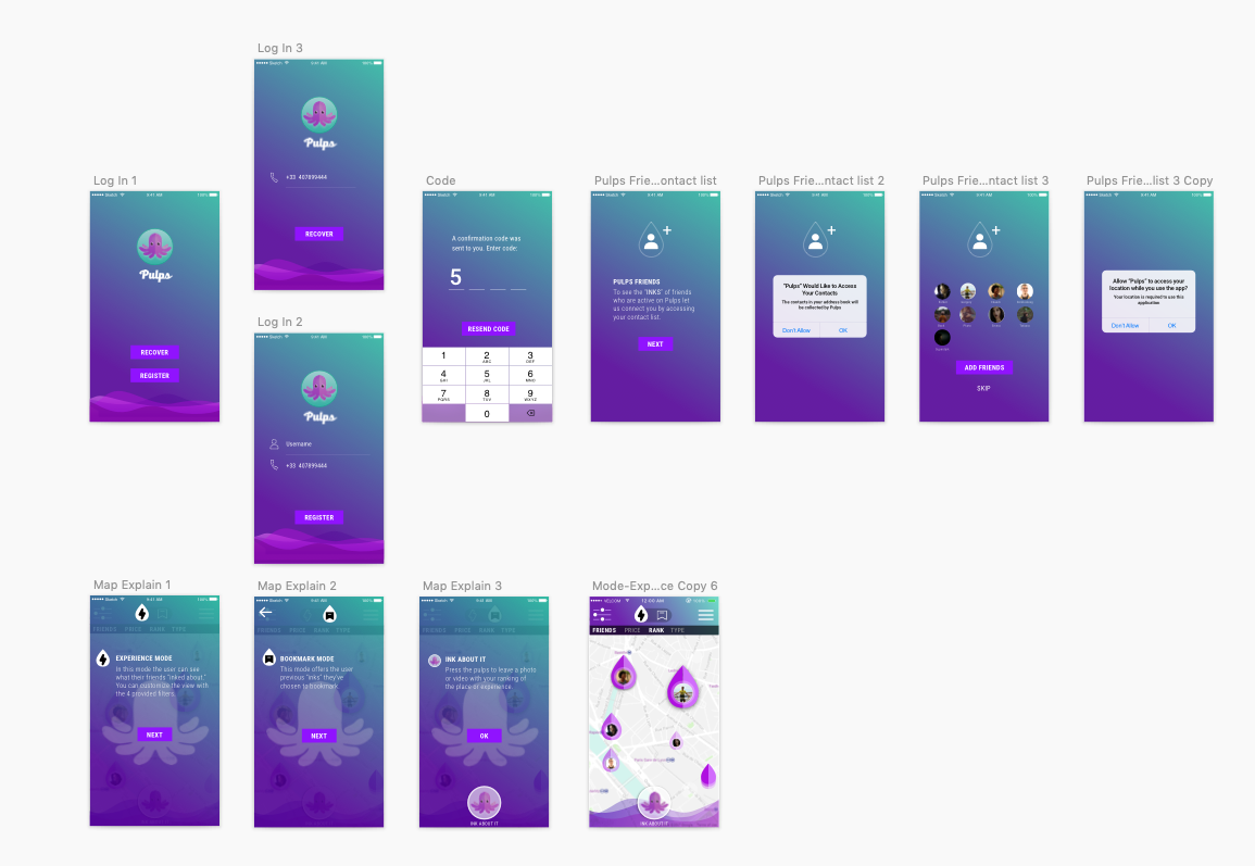
High-fidelity flow - New User
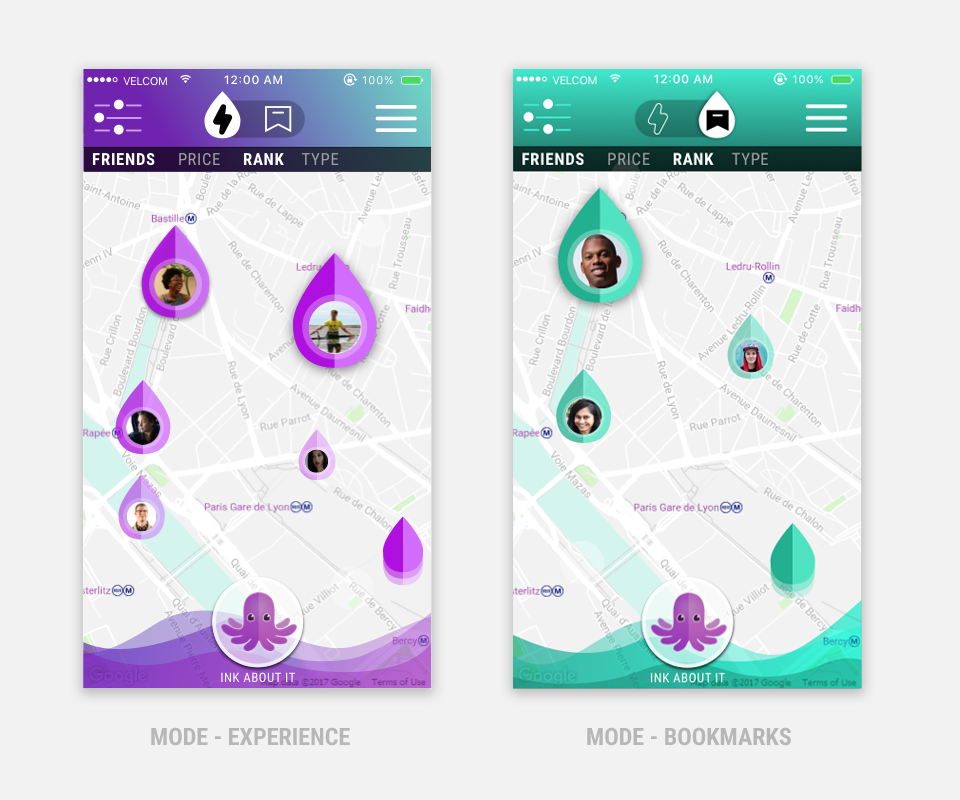
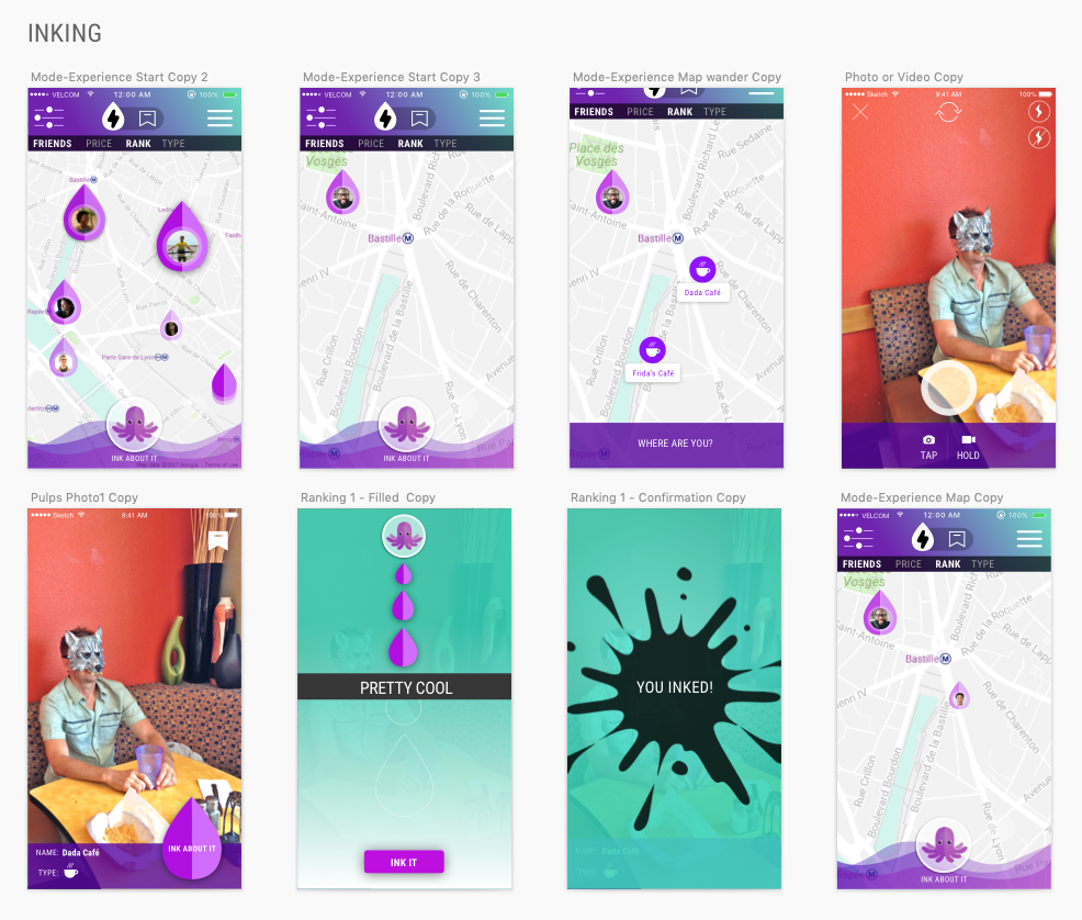
Flow - Inking - ranking an experience by “INKING” it, placing it on map with scale and translucency hinting at ranking score
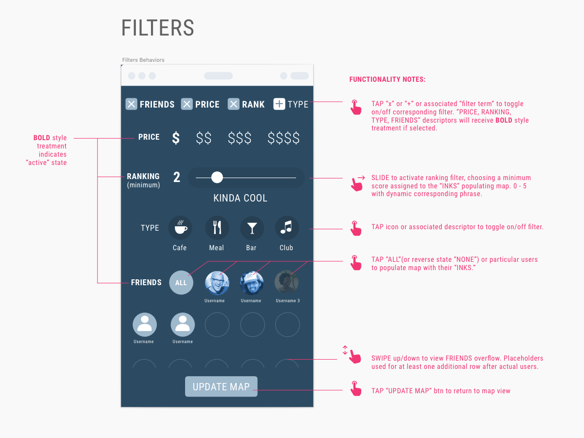
Filters - UI spec w/ functionality notes
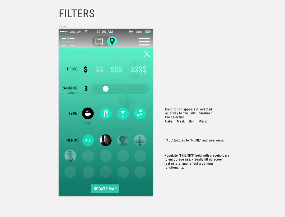
Filters - High-fidelity comp
Ranking - UI spec w/ functionality specs
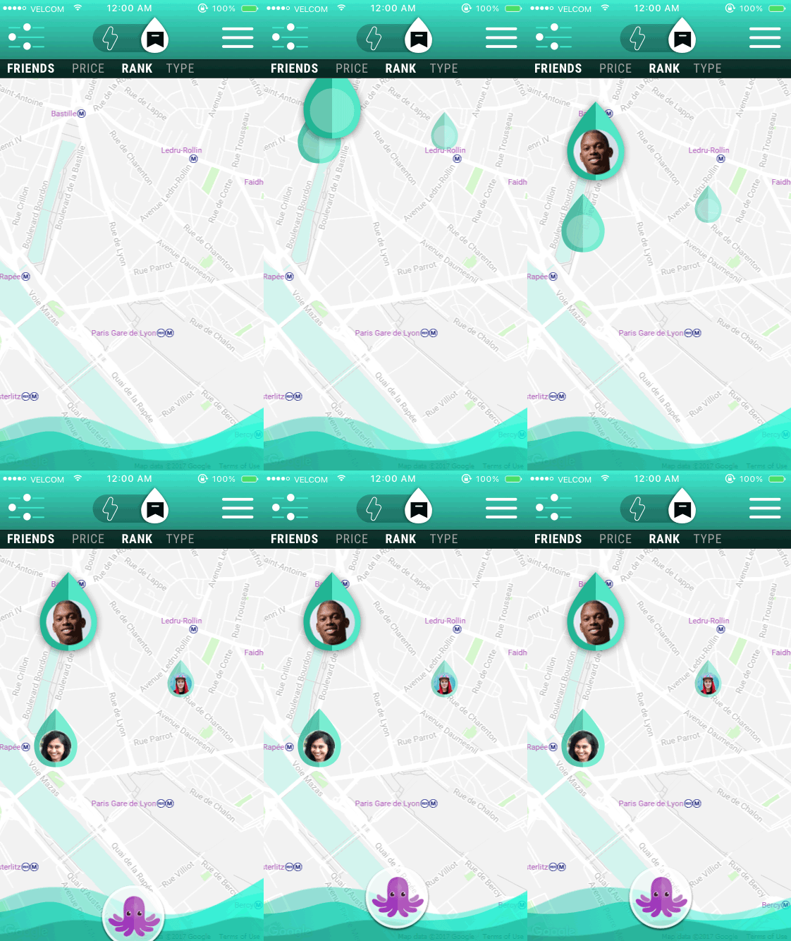
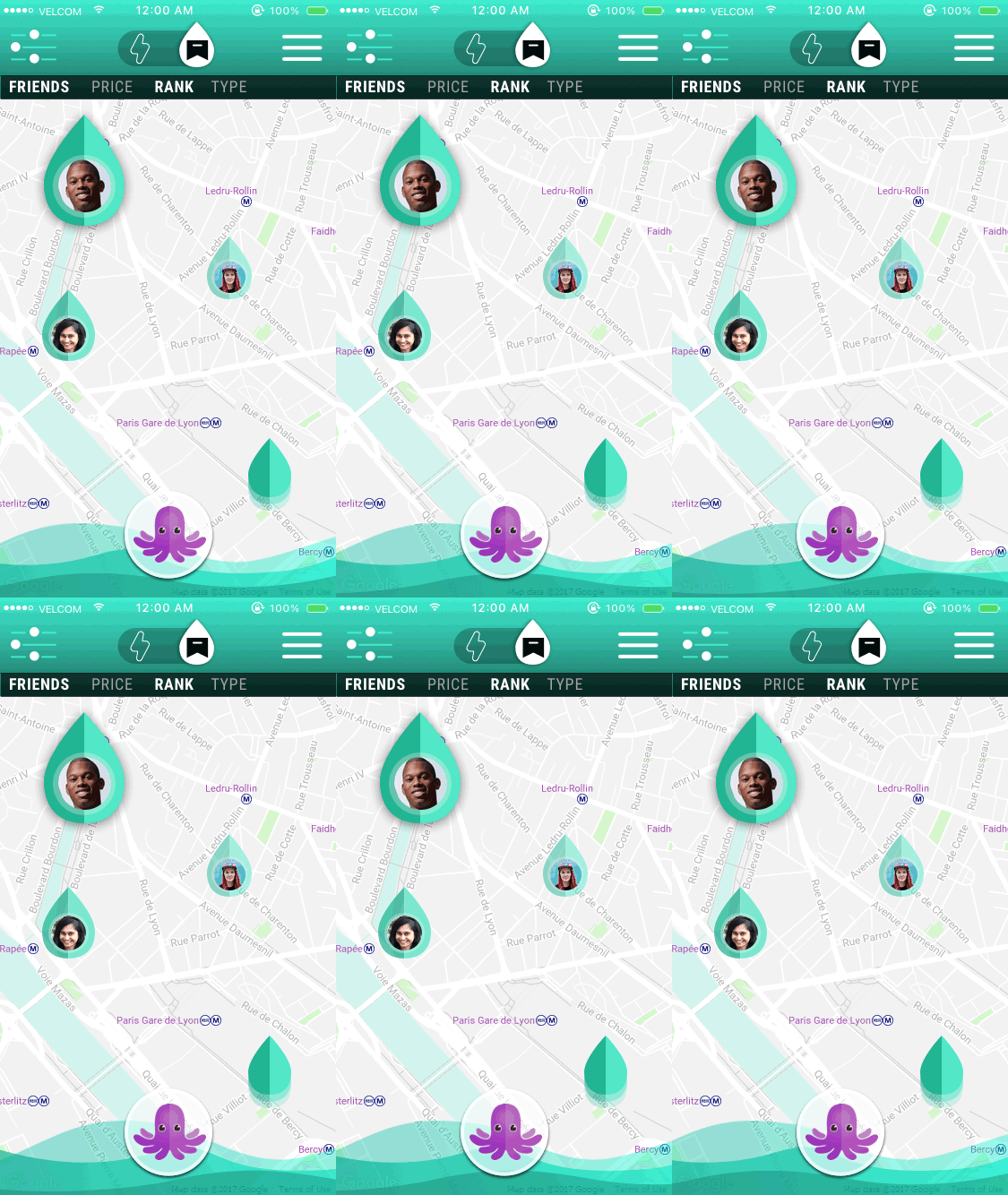
Bookmark mode - Map build. Emphasizing the
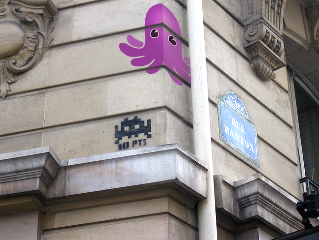
Reinforcing the kinetic sensibility of exploring a city, “dropping ink” as a tagger might, going to LIVE map would trigger an animated build–drops of ink landing on the city and an ambient flow (looping seamlessly, not as seen in proof-of-concept) in the footer to give the app a pulse.
AR exploration for next release
Augmented reality — Clickable PULPS logo pogs that reveal quick reviews made by friends.


